


In order to measure loading times or analyse web performance, many of us turn to PageSpeed Insights. But have you ever wondered how the scores are calculated? What does it really mean to score 50, 70 or 90? And is it even possible to reach 100? Let’s take a look at how Google does its maths.
Lighthouse, a light in the darkness
We have explored the workings of Test My Site, it’s time we looked more closely at PageSpeed Insights.
Since 2018, the scores provided are those calculated by Lighthouse and are therefore synthetic to a certain degree.
These are the web performance indicators collected by Lighthouse and factored into your score on PageSpeed Insights (Google explains how each indicator is weighted in the score calculation here for v5 et v6, and here for v8) :
- Largest Contentful Paint
- Total Blocking Time
- First Contentful Paint
- Speed Index
- Cumulative Layout Shift
- Time To Interactive
When testing a page’s URL, PageSpeed Insights will first produce scores between 0 and 100 for mobile and desktop. A pair of tabs in the top left of the results page allow you to switch between them, displaying the mobile score by default.
So, what do the scores actually mean? It’s simple: a score from 1 to 49 is considered slow, 50 to 89 is considered average, and 90 to 100 is considered fast (if the score is 0, chances are Lighthouse encountered a bug).
The rating scale is calibrated according to measurements collected on the world’s largest sites by HTTP Archive. The highest score possible is 100, which represents the 98th percentile; a score of 50 represents the 75th percentile. In other words, a score of 50 still ranks your website among the top 25% in terms of performance. Nevertheless, the orange colour code can give the impression that this is an average or poor result.

The highest scores are rarely attributed due to the scoring methodology employed, which always assumes the worst-case scenario. Specifically, the mobile score provided by default is often lower than the desktop score, because mobile web performance is harder to optimise. After all, there are greater network constraints on mobile, and a smartphone has less processing power than a desktop computer. In addition, PageSpeed Insights actually simulates a 4G connection that is considerably slower than much of the network in France.
Testing the same page several times withe PageSpeed Insights yields different scores. Why?
Have you ever tested the same page multiple times with different results? As explained in Google’s Scoring Guide, your Lighthouse/PageSpeed Insights score may vary because conditions themselves may differ between tests: network quality, third-party scripts, ads, etc. Lighthouse is also limited insofar as it only takes one-off measurements, whereas genuine statistical data requires repeated measurements to account for potential aberrations.
PageSpeed Insights is harsh but fair
Getting an average or poor score does not mean that the site is unusable – far from it! To illustrate, take a look at the top 20 sites in the mobile web performance rankings for June 2019 (this is a ranking of the most visited French websites)– with home-page scores on PageSpeed Insights in the right-hand column.
Among the most-visited French mobile websites, these are the top 20 in terms of web performance, even though 70% have an average score, only 3 are above 90 and some are even below 50. As we have seen, these scores are variable from one test to the next. While those listed in the table below represent a snapshot at time T, they still provide a reasonable indication of web performance. If you would like to obtain a more reliable score, it’s best to take multiple tests and calculate the median of scores provided – a task that is easily automated:
| Rankings | Website | Webperf Score | Speed Index | PSI Score |
| 1 | Service-Public.fr | 1458 | 1788 |
72 |
| 2 | Wikipedia | 1580 | 1797 |
93 |
| 3 | Ouest France | 2136 | 2603 |
72 |
| 4 | Bing | 2189 | 2212 |
94 |
| 5 | Le Monde | 2231 | 2147 |
78 |
| 6 | YouTube | 2258 | 2352 |
57 |
| 7 | RTL | 2342 | 2708 |
75 |
| 8 | PayPal | 2342 | 2608 |
81 |
| 9 | franceinfo | 2350 | 2720 |
71 |
| 10 | 2351 | 2763 |
96 |
|
| 11 | Groupon | 2522 | 2443 |
64 |
| 12 | 2625 | 2527 |
57 |
|
| 13 | PagesJaunes | 2739 | 3192 |
70 |
| 14 | Cdiscount | 2756 | 2268 |
62 |
| 15 | Météo France | 2780 | 3009 |
56 |
| 16 | Amazon | 2882 | 2101 |
44 |
| 17 | France Televisions | 3135 | 3061 |
40 |
| 18 | La Redoute | 3555 | 3905 |
79 |
| 19 | eBay | 3681 | 3262 |
65 |
| 20 | Booking.com | 3761 | 2926 |
48 |
PageSpeed Insights uses a strict scoring system that encourages web performance optimisation – and that’s a good thing! Although you shouldn’t interpret these results to the letter (or indeed the number), they do invite reflection on how to improve loading times. Any score “in the red” signifies that it’s time to focus on optimising the performance of your website – and that’s exactly our core business.
Now that we understand the methodology behind the PageSpeed Insights score and what this means, we ought to examine the additional results to determine the relevance of the recommendations under Opportunities and Diagnostics – and whether these should be applied.
Breaking down the PageSpeed Insights results page
Field data
The results page of PageSpeed gives an overview of the Core Web Vitals of the tested page for mobile and desktop, indicates the Field Data, and also offers the possibility to observe these metrics for the domain of the tested page (Origin tab). Finally, a box mentions the conditions under which these data are collected.
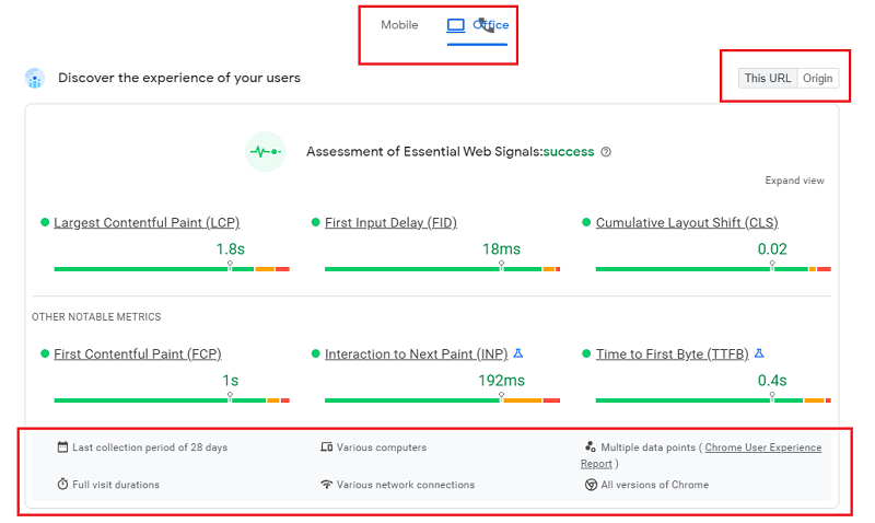
The results in this section are based on CrUX data (a panel of real Chrome users) collected over 28 days, with the option of observing them for the URL being tested, or for the domain in the Origin tab.
Be aware, however, that they do not translate the best possible experience based on the 75th percentile – in other words, 75% of users have an experience of a quality higher than the times translated by these measures (harsh but fair, as we told you).
Google could have chosen to show a median, but in our opinion, it’s also interesting to show extreme values to encourage optimizing loading speed.
Even if the data is not the most representative of all users, it takes into account the most critical cases that should not be left aside. In this respect, the complementary visualization of the distribution of values divided into 3 groups “fast / medium / slow” is interesting.
Please note that the results for Field Data in this section are not the same as those in the next section, which is based on Lab Data, and which we will discuss in the next section. You will understand why the results are not the same: they are the same metrics, but measured using different methods.
You should also know that if your site’s audience is confidential and it is not part of the CrUX panel, Google will not collect all the Field Data, and you will not have access to all the information in this section. You may then see this message appear:

Lab Data
In this section, PageSpeed Insights indicates the performance score via Lighthouse that calculates “laboratory” data by extrapolating results based on a native connection using an algorithm (as opposed to the simulated connection seen with WebPageTest). As such, this constitutes synthetic data, which explains why the results for certain indicators will differ from those in the Field Data section (which is based on RUM data), in addition to the margin of error due to this extrapolation of results.
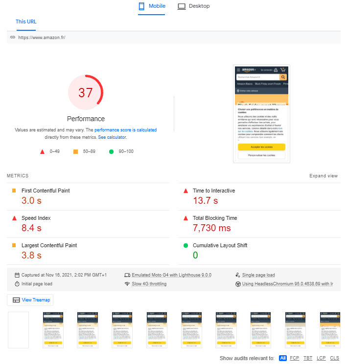
As we discussed, the results are weighted in order to calculate the score of 0 to 100, and ought to be considered from a broad perspective. The same can be said of the advice provided in the following sections of the results page (Opportunities and Diagnostics), which only relates to the page that you tested. Although these recommendations will often be valuable, the conditions for their implementation are not explained, and, above all, they do not provide a systemic overview. Additionally, our tests indicate that the Estimated Savings are highly optimistic – or indeed unrealistic. For example, the recommendations with regard to image compression do not account for perceived quality:
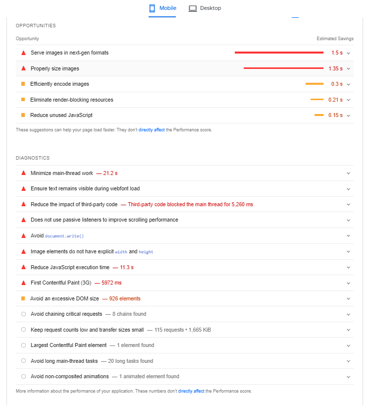
Also, just above the Opportunities section, you can choose to display all recommendations, or sort them by web performance metric:

PageSpeed Insights is also able to identify the CMS used for the tested web page and can offer additionnal information based on it, for example here with WordPress:


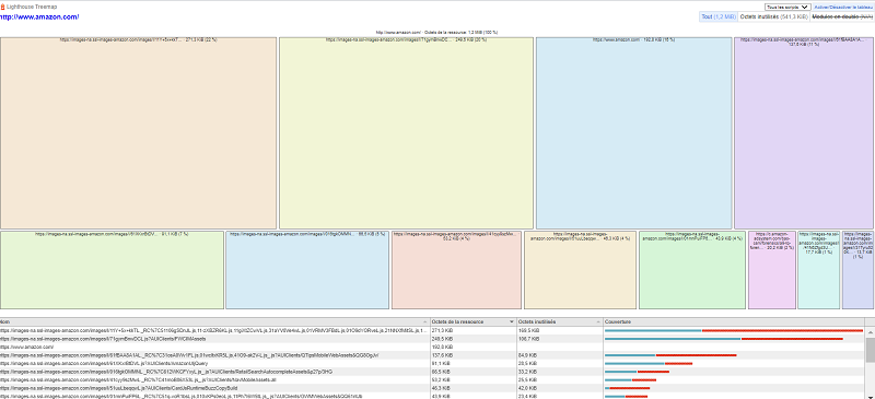
Finally, under the Lab data section, you will see a “View Treemap” button that allows you to visualize the weight of the different resources of the tested page:
How does Fasterize enhance the results marked in red and improve your overall PageSpeed Insights score?
As you can see in the screenshots above, an orange or red colour code is used to denote avenues for improvement.
They may include best practices that really ought to be applied, or recommendations that you may be unable to implement because you are not necessarily in control of the relevant factors.
The same applies to our clients who benefit from automated optimisations via the Fasterize platform, as it is not designed to address 100% of the issues highlighted on PageSpeed Insights.
For instance, if the tool recommends that you optimise third parties, this is unfeasible because the relevant scripts originate from third-party publishers and are highly complicated to optimise through our engine.
Below you will find a summary of everything that Fasterize can improve in terms of the web performance recommendations on PageSpeed Insights. For more information about the relevant operations, please check our Support.
| Lighthouse Notification | Can be fixed with Fasterize |
| Does not use HTTPS | Yes |
| Does not redirect HTTP traffic to HTTPS | Yes |
| Does not respond with a 200 when offline | No |
| Page load is not fast enough on mobile networks | Partially |
| Reduce server response times (TTFB) | Yes |
| Reduce JavaScript execution time | Partially |
| Preload key requests | Yes (manually) |
| Preconnect to required origins | Yes (manually) |
| Ensure text remains visible during webfont load | Yes |
| Serve static assets with an efficient cache policy | Yes |
| Avoid enormous network payloads | Yes |
| Defer offscreen images | Yes |
| Eliminate render-blocking resources | Partially |
| Minify CSS | Yes |
| Minify JavaScript | Yes |
| Remove unused CSS | In progress |
| Serve images in next-gen formats | Yes |
| Efficiently encode images | Partially |
| Enable text compression | Yes |
| Properly size images | Yes (manually) |
| Use video formats for animated content | No |
| Avoid an excessive DOM size | No |
| Does use HTTP/2 for all of its resources | Yes |
| Does not use passive listeners to improve scrolling performance | No |
| ‘robots.txt’ is not valid | Yes |
In conclusion, there are two important points to remember when using PageSpeed Insights, which is a valuable tool, however…
- the results should be kept in perspective;
- when deciding which optimisations to implement – and how – nothing can replace the insight and opinion of a human expert!
Would like to find out more about web performance indicators
and gain more of an insight into the key metrics?