


You’ve been working on the launch, redesign or redesign of your website for months, doing everything possible to ensure that it meets the expectations of your visitors: UI design, user experience, products, speed… You’ve certainly done everything to achieve optimal conversion rates. So, to avoid having to wonder why the layout is faulty on certain browsers, or why load times aren’t good enough on mobile, here are 5 essential checks to test your website before launching it into production: web page speed, Mobile First, browser testing, validation of HTML / CSS / JavaScript code and links… Follow the guide!
This tip makes perfect sense: you need to test your website before you launch it. But what tests should you carry out, and how do you choose the right tool? With these 5 essential (and free) checks, you can avoid unpleasant surprises and malfunctions when you launch your new platform, which could damage your conversion rates, your reputation or your visibility in search engine results pages.
Indeed, beyond the stress of a failed launch for you and your teams, your visitors are likely to turn away from your website if it doesn’t work properly, and go straight to your competitors. They’ll have less confidence and may even never return to your pages if the experience is frustrating.
Even if you’re working with a limited number of people, or on a small project, this easy-to-implement 5-point analysis is a must!
Test and optimize web page speed
You’ve certainly devoted time and resources to ensuring that your website’s content is relevant, the interface aesthetically pleasing, and the navigation paths optimized. But did you know thatyour users’ main UX requirement is… loading speed? In fact, a Google study shows that more than half of visitors leave a page after 3 seconds if it doesn’t load. And as we mentioned earlier, if they do leave, chances arethey’ll never come back.
It’s obviously unthinkable to have invested so much budget, energy, marketing and sales effort, only to see your ROI go up in smoke. So, to meet your visitors’ expectations, you need to measure and optimize your website’s speed! To monitor your loading times, free tools such as :
- PageSpeed Insights, a Google tool that calculates a performance score ;
- WebPageTest, an online tool that lets you visualize a simulation of how different elements of a page load.
Other solutions, such as Dareboost or SpeedCurve, generate alerts when anomalies are detected.
Slowness can be linked to HTML or CSS code, to the way JavaScript is implemented, to the weight of images, to the latency of your server… Of course, we can help you identify the precise origin of any slow-loading problems you may be experiencing. To give you an idea of the impact of speed: one of our customers increased his conversions on mobile by 32% by automating the acceleration of his site using our engine.
One last detail: in this testimonial from the daily newspaper Le Parisien, you will also see thata redesign is not enough to make a site definitively fast, and that optimizing loading times is a long-term project that can require in-depth expertise. As you can see, this is a subject not to be taken lightly.
Have a Mobile First site and test it on different models
We’ve just discussed loading times and web page speed (our credo, as you’d expect), so let’s now focus on mobile.
How do you know if your new site really meets the expectations of your mobile visitors? Yes, mobile users are becoming more and more numerous, and even more impatient than desktop site visitors ! And they’re not the only ones: Google also wants web pages to be fast on mobile, because since September 2020, the search engine has switched toMobile First indexing. In other words, it crawls pages first as if it were a mobile.
So, beyond the aesthetic aspects, for the user experience as well as for SEO, page speed on mobile is crucial, bearing in mind that in 2019, 4/10 Internet users will be using their smartphones exclusively to browse.
For a truly Mobile First site, start by identifying the mobile models most used by your visitors. This will enable you to test your web pages on the devices your visitors own, and not necessarily on the best-performing models. Google Analytics (like traffic analysis tools in general) makes this easy to do:
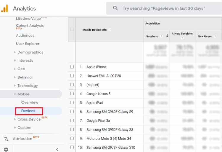
Google Analytics lets you find out which cell phone models are used by visitors to a website
Once you’ve identified the models most used by your visitors, test the speed of your pages taking into account their browsing conditions. In other words, if the majority of your mobile users are equipped with entry-level handsets, test your web pages on this type of phone, and not just on a latest-generation iPhone.
WebPageTest, which we mentioned earlier, enables you to refine these test conditions and choose different cell phone models, network quality and geographical zones:
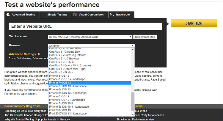
Choosing a mobile model for a WebPageTest speed test
Testing the speed of your pages by simulating conditions that correspond to those of your users gives you a more precise and relevant view of their browsing experience. You can then optimize your pages accordingly.
Also, to estimate the extra sales you could generate by speeding up your site on mobile, Google offers a free, easy-to-use tool: Test My Site.
We’ve carried out a study dedicated to the retailsector in which we detail, by vertical, the lost revenue for sites whose speed isn’t optimized. For example, for the home furnishings market, improving loading times by 25% would generate an average of over 4M euros in additionalsales!
Test a site on different browsers
As with cell phone models, your visitors are likely to browse your website from different OS and browsers (Chrome, Firefox, Edge or Internet Explorer, Opera…), and even different versions of the same browser. The display of your pages may vary from one browser to another, and it’s obviously in your interest to ensure that the quality of the user experience is the same on all your pages, for all your users. Short of having absolutely perfect web pages everywhere and all the time, they should at the very least be functional and fast in all circumstances. But how can this be achieved?
It goes without saying that it’s impossible to manually test all your pages on all browser versions. But tools like Browserstack and Lambdatest make the task easier, giving you an overview of how your pages display on different browsers, and helping you identify bugs.
As far as loading speed is concerned,automating the application of best practices to accelerate your web pages enables you to address all browsers at once, and thus optimize the speed of your website whatever the browsing conditions (device, network, geographical zone…).
Validate HTML, CSS and JavaScript code
You’re happy with the visual appearance of your pages, so why would you test them to validate the HTML, CSS or JavaScript code? Simply because bugs can lurk in your code and degrade the user experience. And as we’ve seen, a frustrating experience due to a site that doesn’t work, or isn’t fast enough, can lead to an increase in your bounce rates and a loss of revenue. What’s more, as Google takes UX into account in its ranking criteria from 2021 by integrating Core Web Vitals into its algorithm, this point also becomes an issue for your SEO.
In addition to user experience and search engine ranking, a clean code also enables you to facilitate upgrades and handovers in the event of a change of technical team or development service provider; and it guarantees that pages will display correctly on as many browsers as possible, a subject addressed in the previous paragraph.
Here are a few (still free) tools to help you validate your code:
- to test the validity of your HTML and XHTML files: W3C Markup Validator;
- to test the validity of your CSS files: W3C CSS validation service;
- or to test the validity of your JavaScript : JSHint.
Also, if you use themes for your site, check their quality. For example, Yoast lists the best themes for WordPress here.
Check your links
Does your site contain broken or dead links? Your users and Google will surely take a dim view of this (another link between UX and SEO ;))
To “fix” this problem, W3C Link Checker helps you identify broken links and also offers recommendations for actions and redirections to implement.
A final tip to optimize the user experience on your pages: remember to apply a recognizable style to your links (underlined text, different color…). This way, your visitors will be able to spot them easily and be tempted to click on them… to spend more time on your site and see even more pages.
Speed, Mobile First, browser, code, links… All these tests should enable you to guarantee the best possible experience to retain your visitors and accompany them to the end of the navigation or purchasing tunnel.
So, now that you’re ready to launch your site, all you have to do is find out how to maintain your performance (and above all, the speed of your web pages) over time!
To keep up to date with the latest web performance news,
and innovations,
subscribe to our monthly newsletter: