


With images taking up ever more space on our webpages, it is ever more crucial to keep their weight to a minimum, especially on mobile. According to HTTP Archive, the average webpage displays approximately 1 MB of images (median), and the images on a page account for almost half of the total weight of the page.
Once you have inevitably compressed it, how do you serve an image in the right dimensions for different screen sizes? In the wake of our predictions in favour of srcset, we decided to set ourselves a new webperf challenge: resizing images!
A feature to streamline the responsive implementation of images
For want of developing a responsive interface, or else entrusting the heavy task of context adaptation to the CMS, a number of websites serve one and the same image on desktop and mobile. Nevertheless, the size of an image should always depend on the size of the screen that displays it, thus avoiding slowdown and wasted bandwidth while downloading, and wasted CPU resources while rendering the image in the browser. Indeed, why would we inconvenience mobile users with an image at 3,000 pixels, if their screens can only display 1,000?
Solutions based on the srcset property or picture tag have been around for a long time, yet many sites do not apply these techniques because they cannot easily generate the images at the desired scale. Nonetheless, these measures significantly reduce image weight according to screen resolution, pixel density and image formats supported by the browser… and therefore optimise page loading times.
For example:
[pastacode lang=”markup” manual=”%3Cimg%20srcset%3D%22elva-fairy-320w.jpg%20320w%2C%0A%0A%C2%A0%C2%A0%C2%A0%C2%A0%C2%A0%C2%A0%C2%A0%C2%A0%C2%A0%C2%A0%C2%A0%C2%A0%C2%A0elva-fairy-480w.jpg%20480w%2C%0A%0A%C2%A0%C2%A0%C2%A0%C2%A0%C2%A0%C2%A0%C2%A0%C2%A0%C2%A0%C2%A0%C2%A0%C2%A0%C2%A0elva-fairy-800w.jpg%20800w%22%0A%0A%C2%A0%C2%A0%C2%A0%C2%A0%C2%A0sizes%3D%22(max-width%3A%20320px)%20280px%2C%0A%0A%C2%A0%C2%A0%C2%A0%C2%A0%C2%A0%C2%A0%C2%A0%C2%A0%C2%A0%C2%A0%C2%A0%C2%A0(max-width%3A%20480px)%20440px%2C%0A%0A%C2%A0%C2%A0%C2%A0%C2%A0%C2%A0%C2%A0%C2%A0%C2%A0%C2%A0%C2%A0%C2%A0%C2%A0800px%22%0A%0A%C2%A0%C2%A0%C2%A0%C2%A0%C2%A0src%3D%22elva-fairy-800w.jpg%22%20alt%3D%22Elva%20in%20her%20fairy%20costume%22%3E” message=”” highlight=”” provider=”manual”/]
Or:
[pastacode lang=”markup” manual=”%3Cpicture%3E%0A%0A%C2%A0%C2%A0%3Csource%20media%3D%22(max-width%3A%20799px)%22%20srcset%3D%22elva-480w-close-portrait.jpg%22%3E%0A%0A%C2%A0%C2%A0%3Csource%20media%3D%22(min-width%3A%20800px)%22%20srcset%3D%22elva-800w.jpg%22%3E%0A%0A%C2%A0%C2%A0%3Cimg%20src%3D%22elva-800w.jpg%22%20alt%3D%22Chris%20holding%20up%20his%20daughter%20Elva%22%3E%0A%0A%3C%2Fpicture%3E” message=”” highlight=”” provider=”manual”/]
In order to overcome these issues, our latest functionality makes it easier to generate images in a specific size. You can write your HTML tags without having to worry about image processing, which is now performed on the fly.
Let’s see how this optimisation works and how it can benefit you.
Two options: resize or crop
Generating multiple versions of an image and serving the one that corresponds to a given screen size is not always possible, or even configurable, depending on the CMS. It’s also impossible to process manually in large volumes.
To make life easier and reduce the weight of your pages, our image resizing feature allows you to define URL settings that will then be applied to your templates – here is a detailed explanation of the available settings on our Support page.
In short, you have two options to resize your images:
- Change the size itself (height/width ratio)
- Crop the image, either by using the automatic “Smart Cropping” function or by defining a gravity position around which to crop the image.
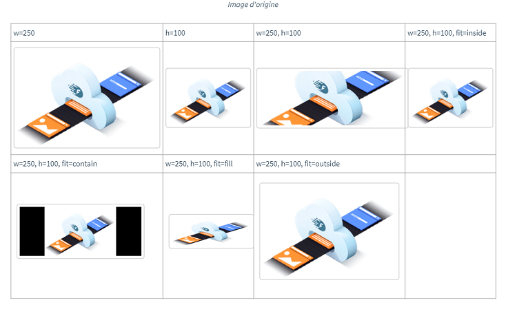
These are a few variants of the same image according to different display settings:
The ability to resize images in real time is the latest step forward in our comprehensive approach to improving image optimisation.
What’s the next step? Currently in the works, the future iteration of the Fasterize engine will calculate the correct dimensions by itself based on the browsing context – and modify the relevant HTML code automatically!
Would you like to follow our developments
and stay up to date with our latest features to boost your loading times?

