


“Make sure text is visible while loading” is the PageSpeed Insights recommendation that brought you to this article. And you did well! Like any site editor, when you created your site, you called on many professions: artistic direction, web design, IT, marketing… And it’s a safe bet that you told them that the site must align with your branding and values . All while ensuring a smooth and pleasant user experience, of course.
But here’s the thing, the fonts in your graphic charter don’t necessarily go well with your users’ experience . Like many resources (CSS, JavaScript , etc.), fonts can, on the one hand, make your pages heavier and thus slow them down , and on the other hand, block rendering if your loading and display strategy is not the most optimal . In this article, we help you make your fonts an asset for your branding and your user experience!
The impact of poorly optimized fonts
Obviously, any degradation in display speed leads to a degradation of your metrics (you saw it on your PageSpeed Insights score). A page that remains blank for too long or that experiences untimely lags makes navigation unpleasant . And what is experienced by your users is also measured by Google. Thus, a font that displays too slowly can negatively impact certain key metrics of the user experience.
For example, the Start Render / FCP can suffer from a poorly optimized font. Indeed, the Start Render / FCP marks the moment when the first element of a web page is displayed in the browser , regardless of its size or interest for the user. This metric is closely linked to the speed perceived by the user. If a font blocks the rendering of the page, this Start Render will be affected.
Cumulative Layout Shift : This metric measures the number of times the display experiences unwanted display shifts.
To have a better CLS, the text must be displayed as early as possible and in such a way that the application of the font does not shift the rest of the content adjacent to this block of text . Indeed, the applied font can change the size of the block and shift the rest of the page. Then, your page suffers untimely shifts, which degrades the UX and at the same time your PageSpeed score.
Third indicator that can be degraded by your fonts, the Speed Index . This provides information on the display speed of the elements in the viewport . It takes into account the progress of the display of the content and therefore measures a duration. As the display of the font is delayed, the complete display of the page is done late and it is your Speed Index that suffers.
If one or more of these metrics is degraded on your site and you have this PageSpeed Insights recommendation, don’t worry. You’re not alone! We often see this issue on the sites we analyze. For example, on some sites, the text is invisible for several seconds. During this time, font calls are made, but are in font-display:block in the code. We therefore make recommendations to the teams concerned to fix the problem.
In the rest of the article, we will support you so that your text is displayed directly and your fonts are used optimally.
What you need to know about fonts
To begin, it is necessary to remember two things. First, as with all the elements that you integrate into your code, your fonts must be as light as possible . Their weight must be optimized to reduce the overall weight of the page and its loading time. To do this, compress your fonts using the WOFF2 font format (the most recent and widespread vector font file format standard).
Furthermore, it is essential to properly manage your fonts themselves. To do this, you can:
- limit the number of fonts used on a page to reduce the number of requests;
- limiting the number of characters in the font (for example, removing Cyrillic characters if they are not necessary), this is the technique of font stripping ;
- use a CDN for fast downloading of font files.
Second, fonts load after HTML and CSS code . And when they are downloaded, the browser can adopt two different behaviors: FOUT or FOIT.

FOUT and FOIT: what’s the difference?
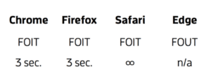
The FOUT: the Flash Of Unstyled Text which displays the text in an unstyled font before displaying the correct font.
The FOIT: the Flash Of Invisible Text which does not display the text until the font is loaded. The text therefore remains invisible.
In order to provide the best user experience , we must avoid invisible text as much as possible (this degrades the Speed Index in particular ). It is with this in mind that browsers have added timeouts when loading fonts. Thus, if after a certain time, the font is not loaded, a fallback font (i.e. a default font) will be used to display the text .
The need for a fallback font
So it is necessary to have a fallback font , in case your web font does not download fast enough. If on top of that, no text appears, your visitors may think that your site is having problems and leave the page.
Caution point: if it is necessary to have a fallback font, you still need to choose it carefully. Indeed, if this font also takes time to load, it will negatively impact the UX. To avoid this, choose a system font as an alternative font, which is available on the majority of operating systems (web-safe fonts).
Also, it should have a similar size to the initial font . If it is larger or smaller, then you risk generating CLS when displaying it. You can use Screenspan to compare the display with your two fonts.
The rule to remember: displaying a font, even “out of branding” is more relevant than making your visitors wait for the right font. And for this, CSS properties exist so that text remains displayed, while waiting for the font that you had initially planned.
Make sure the text remains displayed while loading
1. Use the CSS font-display property
As we have seen, without additional declaration, fonts are a blocking resource during the download of the page. Fortunately, there is the CSS font-display property to improve all this.
Indeed, this CSS property allows you to choose the behavior of the browser when fonts are loading:
- block: here, if the browser does not have the initial font after 3 seconds, it displays the fallback font. This is equivalent to FOIT and is the default behavior
- Swap: With this behavior, the fallback font is displayed directly, and then replaced by the webfont as soon as it is loaded. This is the technique we recommend so that your users see the text displayed, rather than a page with missing text.
- Fallback: This case is an equivalent of swap, where the browser has a timeout if the webfont is not loaded within 100ms. Only after this timeout, the fallback font is displayed, followed by the webfont. In fast contexts, this allows not to have FOUT because the initial font can arrive quickly.
- Optional: in this case, a 100ms timeout precedes the display of the two fonts. The webfont will be displayed on the page as soon as it is available and if the browser decides so.

2. Favor the swap attribute: why?
The swap attribute of the font-display property is the solution that allows you to guarantee the display of the text, with a fallback font . Indeed, the other cases include a timeout, which can be detrimental to the page experience, but also your web performance score.
The main benefit of the swap attribute is the perceived speed for users . By quickly displaying text with an alternate font, page visitors can start reading the page content without waiting , which helps maintain their engagement and satisfaction.
In case of slow internet connection, server issues or geographical limitations, you ensure that text content is displayed to your users . In addition, you can choose a font that is aesthetically consistent, even in less than ideal conditions. Choosing a fallback font can be tricky, however.
Point of vigilance
While you should favor the swap attribute on all your pages, you should still avoid it for icons that display on the page (and more generally avoid icons loaded via fonts) . For example, fonts like fontawesome or icomoon, used to display symbols, are not compatible with swap. The reason? The alternative font does not always take these symbols into account and may display a square as a substitution character.
For these icons, we recommend using SVG instead of text.
In contexts where navigation is fast, the fallback attribute can also give good results, because it directly displays the correct font if it takes less than 100ms to arrive.
3. Use font preloading sparingly
Finally, preloading can also be an asset to use for your fonts. To do this, you can use the <link rel= »preload »> tag to tell the browser to download the fonts upstream. And by preloading your fonts, they will be displayed sooner . Moreover, this technique is complementary with the swap attribute , because you will be able to display the styled text more quickly than if the attribute was used alone.
But this should be reserved for essential fonts (especially for text in the viewport, titles for example). Otherwise, you risk finding yourself in the default case where the fonts will be downloaded before certain more important resources for display. These practices (swap and preload attributes) are therefore the ones to favor if you know what you are doing. However, they must be carried out on all your templates, which requires considerable time and resources.
On the one hand, these are practices to be disseminated within your IT teams , and on the other hand, awareness-raising work must also be carried out with the rest of your teams (marketing, artistic direction, etc.) to limit the use of fonts. As always, we recommend that you automate these practices and surround yourself with experts .
Fasterize’s Font Face feature
By using our solution, you will be able to automatically benefit from the optimization of your fonts regardless of the context . And among them, there is a feature that allows you to apply the recommendations of this article in a few clicks. For your own fonts, you can use “ Insert font display” , then choose the “Swap” declaration. In addition, you can do the same thing for Google fonts .

You will also find in these optimizations of our Police application the possibility of “stripping” your fonts by automatically removing unnecessary characters and of course the conversion to the most compressed format, the WOFF2 format.
With Fasterize font optimizations, you guarantee the earliest possible display and thus reduce your Speed Index and/or your LCP if the largest element on the page is a block of text! Your other metrics are also guaranteed to be improved. By choosing our intelligent engine, you will be able to automate the optimization of your fonts and easily apply the Google PageSpeed Insight recommendation.
You now have the cards in hand to apply it and improve your UX on all your pages. If you are curious to test one of our many smart features, request a demo!