


You certainly track your website’s KPIs to monitor your performance, the number of unique visitors and page views, traffic sources… And as performance enthusiasts, we hope you also track the speed of your web pages thanks to the Speed tab in Google Search Console 😉 But do you have a precise idea of the media used by your visitors? This data is essential for adapting your website to their real needs, and making your pages fast for everyone, everywhere, all the time.
Network and mobile equipment: knowing your users’ browsing context
In addition to using personas to define the needs and expectations of the target audience for your products or services, you also need to know the context in which your visitors consult your web pages.
This will have a major influence on their user experience. Why do you need to know this? Simply because the speed of web pages can vary depending on whether they’re displayed on mobile or desktop, with a fiber, ADSL, 4G, 3G or Edge connection, or even no connection at all!
We’ll see that while mobile usage continues to grow, it’s generally on the desktop that a browser remains most capable of displaying a web page quickly. In the e-commerce sector, this is certainly one of the reasons why conversion rates on mobile devices in France are still 2 to 3 times lower than on the desktop: Internet users browse on mobile devices and buy on the computer or in the store. Let’s take a closer look at the reasons for this phenomenon, and see how a Mobile-First site can help you reverse this trend.
Mobile network quality
On mobiles, network quality is not always up to scratch (in technical terms, it’s latency). As a result, web pages may take longer to display, resulting in poorer loading times.
For example, in the UK in 2019, 8% of indoor spaces have no mobile data coverage. This is the case in regions such as Essex or Suffolk, where mobile users sometimes have to move to very specific locations in their homes or gardens, and put themselves in acrobatic positions to get network reception.
In France, some residential areas are still not covered by either 3G or 4G, as can be seen on this map produced by Arcep.
As a website publisher, you obviously don’t have control over the network, but you can optimize your pages so that they display as quickly as possible, even in these degraded conditions.
So, to offer a quality experience to all your users, wherever they may be, you need to take into account these cases, which may seem like exceptions to you, but which can nevertheless represent a significant proportion of your mobile audience.
In addition to network quality, the cell phone model also comes into the equation when it comes to loading times.
Processor power on mobiles
Desktop computer processors generally enable web pages to be displayed faster than on cell phones. Cell phone processors are often less powerful. What’s more, an entry-level phone is bound to have a less efficient processor than a state-of-the-art phone.
This is something to bear in mind, because the heavier your pages are (due to resources or poorly optimized HTML / CSS / JS code…), the longer they take to display, whatever the device. Obviously, this slowness will be even more noticeable on an entry-level mobile, especially if your pages contain a large proportion of images or JavaScript files.
But when you consider that speed is the most important UX criterion for mobile users, and that 53% of them leave a page after 3 seconds if it hasn’t loaded, you’ll understand: you absolutely must take care of your loading times on all devices! It’s vital for your image, your conversion rates and your SEO. And for good loading times, it’s not enough to test your website’s speed only on the latest generation of cell phones.
So let’s take a look at how you can get to know your audience better, simply by using Google Analytics data.
How to find out a website’s mobile audience
In the Audience – Mobile tab of Google Analytics, you can first observe the proportion of traffic coming from mobile versus desktop.
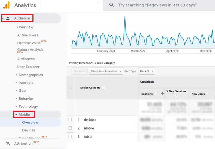
Then investigate a little further, in the Devices tab:
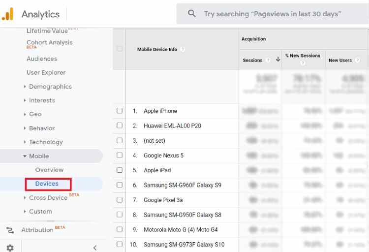
This is where you can find out which cell phone models your users are equipped with. This is invaluable data, especially for knowing under what conditions to test your site.
If you optimize your web pages by testing them only on powerful phones, they will certainly display quickly in the browser of a recent, high-end mobile. But what about on a browser for an entry-level mobile?
So, if your audience is predominantly equipped with low-powered mobiles, you need to take this into account for the quality of their user experience.
And beyond the user experience, have you thought about your SEO? Indeed, for your SEO, your pages need to load quickly so that Google’s robot can browse and index a maximum number of pages in a minimum amount of time.
This is all the more important as since September 2020, the search engine has switched to Mobile-First indexing; in other words, it crawls your website’s pages first as if it were a mobile. And just like your visitors and customers, the Google robot doesn’t like wasting time.
So, to help you out, here are a few tips for testing your site and optimizing it so that it’s truly Mobile-First.
How to test and optimize web page speed on mobile for a Mobile-First site
How to test the speed of a mobile site
To find out how fast your site is, and what you can do to optimize the speed of your web pages, you naturally need to test your web performance on mobile.
- Google offers a free, easy-to-use tool for this purpose, which can also be used to estimate the additional sales you could generate by speeding up your pages on mobile. It’s called Test My Site.
- The search engine that actively promotes a faster web also offers PageSpeed Insights, another free tool that generates a speed score and provides general recommendations on how to make a web page faster.
- If you’re familiar with speed monitoring, you can also venture onto WebPageTest, a reference for the webperf community. This tool lets you define test conditions for your pages, indicating cell phone model, network quality…
And now that you’ve identified the profile of your users, the mobiles they’re equipped with, and tested the speed of your web pages according to different browsing conditions… how do you go about speeding up your site?
How to optimize web pages for mobile
Speeding up a mobile site has nothing but advantages. It’s good for the user experience, and therefore for your conversion rates, since your visitors will be more likely to get to the end of the purchase tunnel, rather than leaving your website because it’s too slow.
As we’ve seen, it’s also a strength for your SEO. In addition to Mobile-First indexing, you should know that Google is integrating page speed into its algorithm with its Page Experienceupdate , which includes new signals called Core Web Vitals.
So, what are you waiting for to speed up your web pages on mobile?
Here are a few techniques you can explore in more detail:
- Optimize your images for lighter pages (compression, resizing);
- Reduce the size and weight of your resources (HTML, CSS, JavaScript files…);
- Adopt a CDN to bring content closer to your users;
- Take care of your caching…
Optimization techniques and best practices for speeding up web pages are numerous and rapidly evolving. You can automatethem to save resources and increase efficiency, and make sure that they work correctly in relation to each other (our engine includes dedicated mobile optimizations). This automation also saves time for your technical teams, who don’t need to intervene in the code, while taking the load off your server.
Here are a few concrete examples: automating the application of best practices and webperf techniques,
- ready-to-wear brand IKKS improved its mobile conversion rates by 20% with new customers;
- furniture specialist But, with 70% of its traffic coming from cell phones, also saved 1 second in loading time on this device.
So, what are you waiting for to step up a gear to a Mobile-First site, fast everywhere, all the time and for everyone?
To find out more about the impact of loading speed on your user experience,
your SEO and conversions, read our white paper :
