









How do your visitors ‘experience’ your website? You’re here to read an article about performance, and we’re going to talk about emotions. But, if you weren’t already convinced, you’ll see that performance and emotions are closely linked.
The original article can be found in English on Philip Tellis’s blog
Performance and emotions: an introduction
Given that the role of a website publisher is to showcase the products and services a company provides to its users, let’s look at how to assess the satisfaction derived from the online experience surrounding these products or services.
The state of the art in speed measurement
The art of measuring the effects of latency on users dates back no less than 250 years. Today, we call it Real User Measurement (RUM), and this concept has come a long way since Steve Souders’ early days at Yahoo. Browsers now offer numerous APIs to retrieve performance metrics to help website publishers make pages load faster. At the same time, Google’s Core Web Vitals initiative enables us to monitor metrics related to user experience. These metrics, whilst highly useful in practice, do not, however, accurately reflect how users actually feel; nor are the reasons why we should optimise them necessarily obvious. Indeed, simply
being aware of them does not enable us to directly address business or product issues. Answering the question “Why invest in web performance?” is not as straightforward as answering “Why develop a particular feature?” (because users need it), or “How should we prioritise our projects?”. For your information, Andy Davies published a post about the link between page load speed and business benefits, in which he points out that:

Context influences experience, experience influences behaviour, and behaviour influences business revenue.
All the metrics we collect and optimise help to improve the context, but in reality, we spend very little time measuring and optimising the rest of the process.
Shifting gears
After around a decade working on tools such as Boomerang and mPulse (editor’s note: Philip Tellis is Principal RUM Distiller at Akamai), the conclusion is this: work on web performance metrics is developer-centric. In other words, priority is given to measuring and optimising metrics that are useful… from the developers’ perspective – who are equipped with powerful tools and browsers featuring shortcuts to development tools. So, after shifting our perspective and looking at the experience from the point of view of customers and web users, the useful metrics became clearer and relevant questions emerged:
- What does a 100 ms improvement in speed actually mean?
- Are all 100 ms the same?
- Do all users perceive these 100 ms in the same way?
- Is performance really the most important thing?
Building on these observations, let us now turn to the topic of evaluating user experience and its effects on behaviour, what we can deduce from this behaviour, and its impact on business revenue.
Satisfaction and frustration
In
Group Psychology and the Analysis of the Ego, Freud notes that “frustration arises when inhibitory factors interfere with or interrupt the achievement of a goal”. Visitors to your website are pursuing a goal. They may be researching something with a view to taking action later, they may want to buy something immediately, or they may be looking for an article they’ve read so they can share it… Generally speaking, anything that slows down or prevents the achievement of these goals causes frustration, whilst, conversely, anything that helps them achieve these goals brings satisfaction. How users feel whilst browsing your website has a direct impact on the likelihood of them returning and ‘converting’ (turning their visit into a purchase, or becoming customers themselves). It all depends on how you define ‘convert’.)
The link between latency and frustration
In 2013, Tammy Everts and her team at Radware set up a
usability testing laboratory. The study involved observing participants as they shopped on a series of websites, whilst connected to an electroencephalogram. For half of the users – without any of the groups being told – page loading times were artificially slowed down. Whilst they all believed they were testing the websites’ usability, the study revealed that:

An additional connection delay of 500 ms led to peaks in frustration that were up to 26 per cent higher, and a drop in engagement of up to 8 per cent.
In a similar vein, in 2015, the Ericsson ConsumerLab neuroscience research centre studied the effects of latency on mobile phone users. This study found that slow-loading web pages cause a 38 per cent increase in heart rate – equivalent to the level of anxiety experienced when watching a horror film alone. This film genre is not necessarily to everyone’s taste, and furthermore, the direct consequence is that users then made a decision – consciously or unconsciously – to stay on the page, leave it only to return, or leave the site for good.
Cognitive biases
It is also important to recognise that various cognitive biases impact the individual experience and influence perception and behaviour. Understanding these biases, and intervening when an experience takes a negative turn, can improve the overall experience. Here are a few of these cognitive biases.
Sensory dissonance
Sensory dissonance arises from unexpected situations following routine actions. More specifically, the brain is capable of anticipating events; for example, determining whether a car is travelling slowly enough to allow time to cross the road safely. If events do not unfold as expected, this provides an opportunity to process new information. However, if the sequence of events challenges deeply ingrained assumptions, or if the events are inconsistent, learning becomes impossible and leads to psychological stress and frustration. On the internet, users expect websites to behave in a certain way: links are supposed to be clickable, sites should generally scroll vertically, and so on. If there is an interruption whilst scrolling, if nothing happens when a user clicks on a link (broken links), or if a clickable element moves unexpectedly, this causes cognitive dissonance and frustration. However, if these negative experiences are recurrent, users come to terms with them. Indeed, studies show that users in geographical areas where the internet is slower than average tend to be more patient whilst web pages are loading.
Survivor bias
We only measure data for users who can access our site. Nevertheless, for some users, a very slow experience is still preferable to an inaccessible site. In 2012, after YouTube had streamlined its site, Chris Zakariahs nevertheless found that overall performance had deteriorated. The data revealed that new users who had previously been unable to access the site were now part of the long tail. The site seemed slower overall, but the number of users who could access it had increased.
The negativity bias
This stems from the fact that users are more likely to remember and tell their friends and family about their bad experiences on a site than their good ones. You only need to do a Twitter search for “$BRAND_NAME slow” to see the number of complaints about bad experiences. Bad experiences are also perceived as much more intense than good ones. Therefore, to achieve an overall neutral experience, bad experiences must be balanced out by good experiences that are even more intense. A single bad experience during a session makes it harder to feel generally satisfied.
Active listening
Research shows that practising
active
listening can have a significant impact in countering the negativity bias. Simply acknowledging a mistake and admitting that user expectations have not been met can mitigate negative perceptions. If JavaScript detects that a page is taking too long to load, it would be worth displaying an information message such as: “We’re sorry, loading is taking a little longer than expected. We apologise for this inconvenience and thank you for your patience.” Users will be more forgiving as long as they feel understood and their frustration is acknowledged.
Measuring emotions
There are numerous methods for assessing the emotional state of a website’s users, ranging from active engagement to more intrusive means. Although some are not applicable in all situations, we will outline them below:
- Affective computing, i.e. tools for analysing facial expressions, electroencephalograms, heart rate monitoring, etc.
- Satisfaction surveys
- Observation of commercial revenue generated based on behaviour
- Behavioural analysis
Affective computing
For website publishers, affective computing cannot be enabled. Techniques such as eye tracking,
wireless brain-computer interfaces
and other
affective computing methodologies are too intrusive. They are restricted to a laboratory setting where users consent to this type of monitoring and can be connected to measuring devices. It’s useful, but it would be frightening to enable these features for everyday internet browsing.
Satisfaction surveys
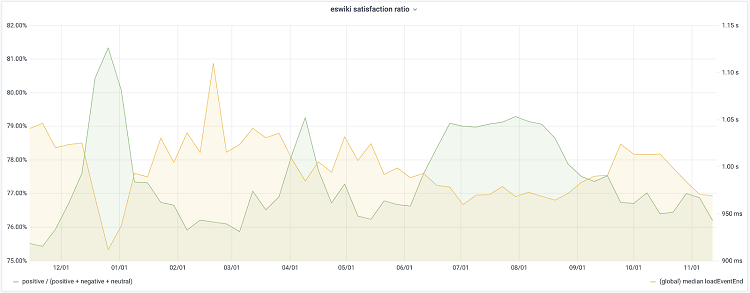
Asking users directly about their level of satisfaction is an effective method, as shown by a
recent Wikipedia study. A very simple dialogue box was used, featuring ‘Yes’, ‘No’ and ‘No opinion’ options in random order. The finding was as follows: the quality of the experience as perceived by users is inversely proportional to the median load time. A temporary 4 per cent improvement in page load time resulted in an additional 1 per cent of satisfied users:
This method relies on active user engagement, but is subject to
selection
bias and the Hawthorne
effect. As regards reducing selection bias, it is still difficult to identify precisely the types of experiments that would minimise the effects of this bias and encourage users to respond. It is also difficult to know exactly how to
design the survey module to maximise the number of respondents. Furthermore, the Hawthorne effect means that individuals behave differently if they know they are being observed.
Monitoring commercial performance
Measuring business outcomes is necessary, but we cannot be certain about the context that led to a given result. We must first understand the intermediate stages of the user experience and behaviour, as we mentioned earlier. For example, when it comes to bounce rates, we cannot say for certain that a user left a site because the user experience was poor, or simply because they came to browse and will return later to complete a purchase.
Behavioural analysis
Applying the findings of laboratory research to website users in real-world conditions can help link the user experience to behaviour. First, let’s introduce some new concepts: Rage Clicks, Wild Mouse, Scrandom and Backtracking – signals that we will detail below. They reflect users’ activity in response to their expectations regarding how a web page will behave. The correlation between these metrics and contextual metrics such as the Core Web Vitals on the one hand, and business outcomes on the other, can help to better define the performance metrics to focus on.
Annoyance, frustration and confusion
To measure annoyance, frustration and confusion, let’s examine Rage Clicks, the
Wild Mouse
phenomenon, and backtracking
Rage Clicks
Rage Clicks occur when users click their mouse frantically. It is the digital equivalent of swearing to release frustration. You’ve surely all experienced this at some point: you click once, nothing happens; you click again, still nothing; then again and again. This may be the result of an interactivity issue, or because users expect something to be clickable when it isn’t. Rage clicks can be measured easily and non-intrusively, and they’re simple to analyse. Here are some more resources on rage clicks if you’re interested in the topic.
Wild Mouse
Research shows that
angry people are more likely to use their mouse in a forceful, yet surprisingly slow,
manner. People who feel frustrated, confused or sad are less precise in their mouse movements and move the mouse at varying speeds. Certain
mouse movements are common when a user is browsing a website. In particular, horizontal and vertical scrolling suggests engagement with the content. Conversely, random movement or jumping between options on a form may suggest confusion, doubt and frustration. The
full data from this study can be viewed here. To assess the intensity of this phenomenon, the Dawdle.js JavaScript library can help classify these mouse usage patterns.
Scrandom
Scrandom
describes the act of scrolling a page randomly from top to bottom without a specific scrolling target. This may indicate that the user is unsure about the content, that the page is too long, or that they are waiting for something to happen and checking that the page is still responsive without risking accidentally clicking on anything.
Backtracking
Backtracking is the process of clicking the back button on a page. Users who are confused or lost on your site may frequently press this button to return to a familiar place. This behaviour can manifest in various ways, but is often linked to very long sessions that seem to go round in circles.
The link to the timeline of a web page’s loading
In this post entitled
‘Web Page Usability’, Addy Osmani sets out that page loading is a progressive journey marked by four key moments:
Is anything happening? Is it useful? Is it usable? Is it satisfying?
Here is an illustration of this process:
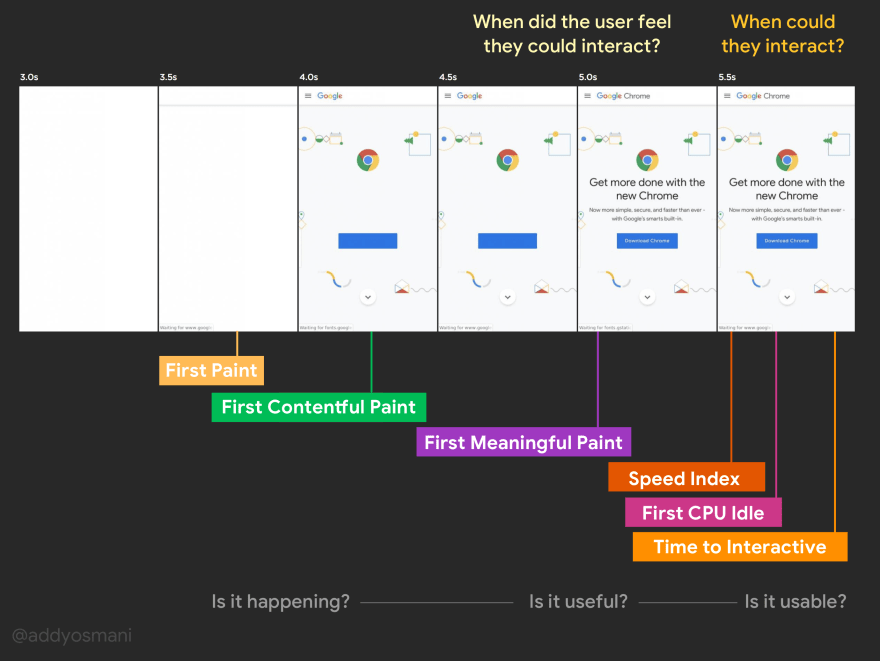
The first three stages are fairly objective. With only a few minor differences between browsers, it is straightforward to extract this information from standard APIs and, where necessary, supplement it with custom APIs such as User Timing. We’ve found that over 65 per cent of users expect a site to be usable once elements have started to become visible, but before it’s actually interactive. You can put this figure into perspective with the 30 per cent who will wait until the page has finished loading.
The correlation between Rage Clicks and events during loading
By correlating the moments when users engage in Rage Clicks with the loading
timeline
above, patterns emerge.
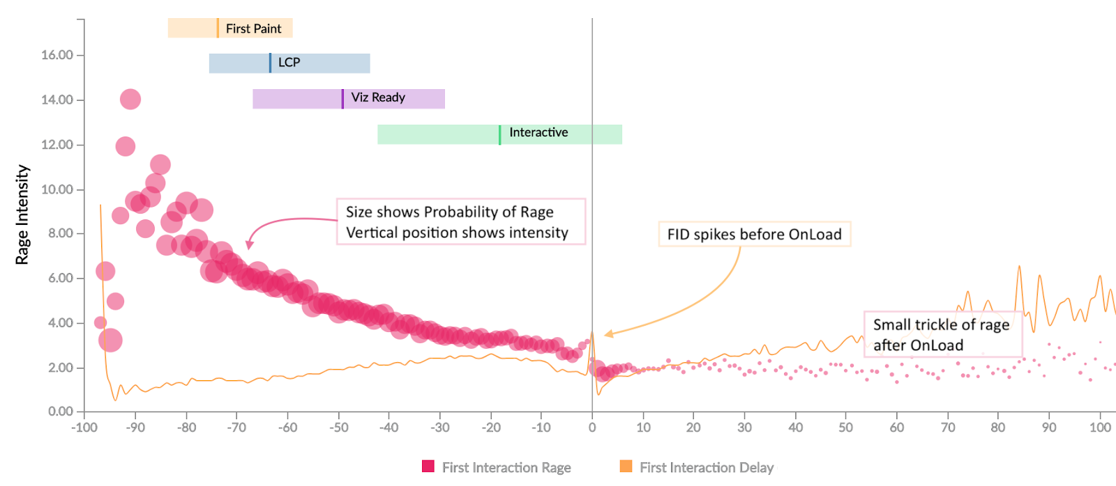
The horizontal axis of this graph represents time as a relative percentage of the total page load time. -50 indicates halfway through the page load time, whilst +50 corresponds to 1.5 times the page load time. The vertical axis indicates the intensity of Rage Clicks, whilst the size of the dot indicates the probability of Rage Clicks at that precise moment. The coloured bars indicate the ranges from the 25th to the 75th percentile for the metric following full page load, and the horizontal line indicates the median.
Here we can see a great deal of frustration between the moment the content becomes visible and the moment the page becomes interactive. Users expect to be able to interact with the page shortly after the content becomes visible, and if this expectation is not met, the result is… Rage Clicks. We also see a slight surge in Rage Clicks after the page has loaded, caused by the delay before users can interact with it
. There is a brief lull just before the Onload
event is triggered, which occurs once the JavaScript event handlers run; these, in turn, result in Long Tasks and consequently increased interaction delays. What we are observing here is not a lack of interactivity, but a bias whereby interactions that occur at that moment are only made possible later on. The horizontal axis of this graph represents relative time along the page’s loading timeline. We examined various combinations of absolute and relative time across several markers, and it became clear that relative time is a more relevant model, leading us to a new metric based on relative markers…
The Frustration Index
The Frustration Index, developed by Tim Vereecke,
is a measure based on the relationship between loading phases. We have seen that once an event occurs, users expect the next one to happen within a certain timeframe. If this expectation is not met, the user perceives that something is halting or hindering their ability to achieve their goal, leading to frustration. The Frustration Index captures this phenomenon. The formula used is constantly evolving as research brings new insights to light, and it is useful to observe it directly on a website to understand exactly how it works and draw on real-world examples. So, how can we verify that this is a valid metric to analyse? Let’s look at the correlations it helps to establish.
Correlating annoyance (Rage Clicks) and frustration
It turns out that there is a strong correlation (ρ = 0.91) between the intensity of annoyance (vertical axis) expressed by a user through ‘Rage Clicks’ and the Frustration Index (horizontal axis).
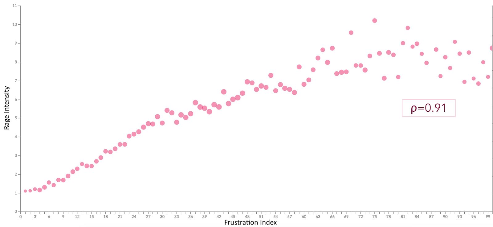
Rather than tracking individual metrics to optimise performance, it is better to consolidate all metrics. Improving any one of them alters the user’s expectations regarding when subsequent events should occur, and failing to take this into account leads to frustration. Furthermore, the formula can be applied on the client side to determine whether expectations are being met, and to practise active listening if they are not.
Correlating frustration with commercial revenue
By observing the correlation between the Frustration Index and certain business metrics, we can also identify these patterns:
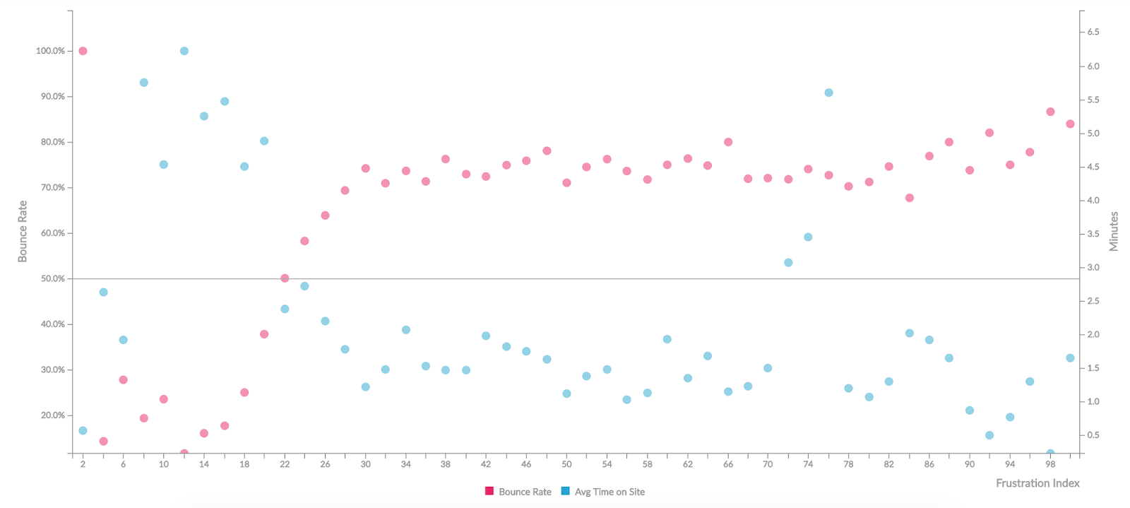
- The bounce rate is proportional to the Frustration Index, with a steep slope around what we call the LD50 point (for this particular site). ρb=0.65
- The average time spent on a site decreases as frustration increases – we see a sharp peak at the start, followed by a decline. ρt=-0.49
LD50
The LD50, or median lethal dose, is a concept borrowed from the natural sciences. Buddy Brewer first applied it to web performance in 2012, and we have been using it ever since. In biology, it is the dose at which a toxin kills 50 per cent of the sample, whether tumour cells or mice. On the web, we tend to think of it more in terms of the point at which 50 per cent of users decide not to continue their journey. We could apply this to the bounce rate, the retention rate, or any other key metric for a website, and the ‘dose’ could be a metric value, such
as the Frustration Index… Depending on the metric chosen, we can also use a percentile other than the median, for example, LD25 or LD75. This is not a single, magic figure that works for all websites. Nor is it a single figure that works for every page on a site or for every user. Different pages and different sites have varying levels of importance to a user, and their emotional state – or even the condition of their device (e.g. low battery) – can affect their patience.
Patience is also a cultural phenomenon
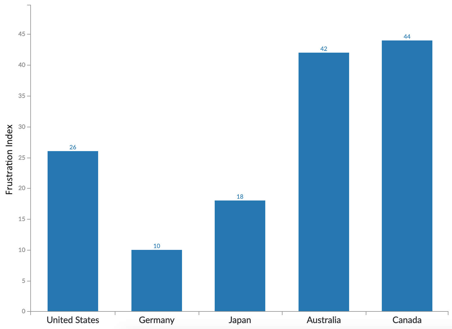
The frustration threshold varies from country to country. For international websites, versions may be distinct and tailored to each region, and it is also important to recognise that users have different expectations regarding a website’s speed depending on their geographical location. In this graph, looking at five high-GDP countries (for which data is available), we see a wide distribution of the
LD25
value, ranging from 10 for Germany to around 40 for Australia and Canada. The graph does not show this, but the difference is even greater when we look at the LD50: Germany is at 14 and Canada at 100.
So… How fast should your website be?
We hear a lot about how our website’s performance affects the user experience and, consequently, how our users feel. We’ve seen how perceptions of a website can affect a company’s business results, but what lessons can we draw from this regarding how to design a website?
- How fast does a website need to be to minimise frustration?
- What should be included in a performance budget?
- How can we keep our users happy?
Let’s remember that these may be secondary questions… and that the first one to ask might be:
Will adding a new feature be a source of satisfaction or frustration for the user?
To find out more about the impact of page load speed on your digital strategy,
user experience, SEO and conversion rates, check out our white paper: