








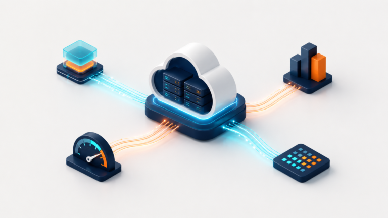
Your CDN handles thousands, sometimes millions, of requests every day. It delivers your content, absorbs part of the load on your infrastructure, and plays a central role in your website’s availability and delivery quality.
The challenge starts when one of your metrics changes. Traffic suddenly increases. Error rates rise. Cache efficiency drops. Bandwidth usage goes up. Response times shift.
Taken individually, each of these signals tells you something. But it is by putting them back into context that you can really start to understand what is happening.
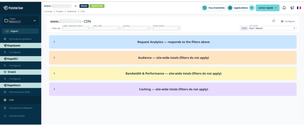
The new CDN dashboard available in the Fasterize console brings together, in a single view, the main metrics you need to monitor your CDN activity: requests, HTTP status codes, cache performance, bandwidth, response times, content types, geographic distribution, and traffic type.
The goal is to help you spot changes more quickly, assess anomalies, and focus your analysis where it is really needed.
Spot what’s changing, then understand where to look
A change in traffic is not necessarily a problem. A spike may be linked to a campaign, a sales event, increased activity in a specific country, or even crawler traffic. Conversely, a sudden drop may be perfectly expected… or it may be the first sign of an incident.
So the first question is not simply “how many requests is my CDN handling?”, but rather: “is what I’m seeing consistent with my website’s activity?”
The Request Analytics section lets you track request volume over time and put it into perspective with the HTTP responses returned. If traffic increases at the same time as the error rate, the situation clearly needs to be interpreted differently than if 2xx responses remain perfectly stable.
This is where filters become particularly useful. A change can be analyzed by country, Cloudflare Point of Presence (PoP), HTTP status, or cache status, allowing you to progressively narrow down the scope of your investigation.
A broad signal can then become a much more precise question.
Is the issue affecting the entire website, or only part of the traffic?
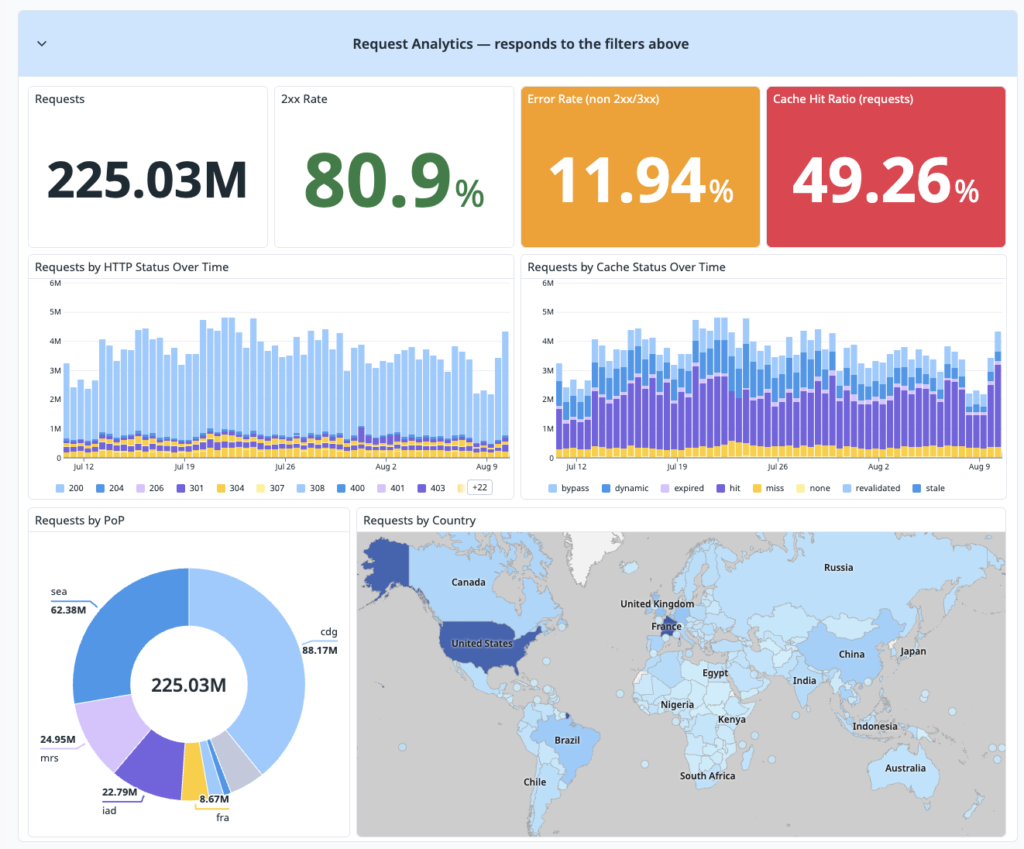
The same logic applies to errors. You can monitor the 2xx response rate, the error rate, and the distribution of requests by HTTP status code. This makes it possible, for example, to spot an unusual increase in errors and check whether it corresponds to an isolated event or a trend that is starting to emerge.
The dashboard is therefore not just about noticing that a metric has changed. It helps you move from a signal to the right scope of analysis.
Understand what your CDN is really absorbing
How much of this load is your CDN actually absorbing?
The Cache Hit Ratio provides a first indication by showing the proportion of resources served directly from cache, without reaching your origin infrastructure.
But looking only at the number of requests can give you an incomplete picture.
Imagine that your CDN serves a large number of small resources from cache, while the heaviest content still has to be fetched from your origin. Your Cache Hit Ratio based on request volume may look healthy, while the bandwidth view tells a different story.
That is why Fasterize lets you compare the Cache Hit Ratio by number of requests and by bandwidth.
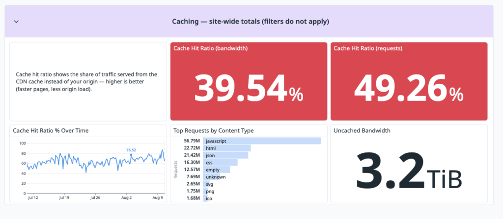
This dual perspective helps answer a more practical question: is your cache simply handling a large number of requests, or is it also absorbing the content that actually drives your bandwidth usage?
The dashboard also shows the bandwidth that is not served from cache. By tracking it over time, you can identify a decline in cache efficiency and determine whether it is temporary or persistent.
And once again, a metric becomes much more useful when viewed alongside the others.
Comparing both views therefore allows you to understand not only how many requests are served from cache, but also whether the cache is absorbing the content that has the greatest impact on your bandwidth consumption.
The dashboard also displays uncached bandwidth and changes in the Cache Hit Ratio over time. This allows you to check whether cache efficiency remains stable and identify periods that may require further investigation.
If bandwidth increases, what is causing it?
HTML, JavaScript, images, CSS, WebP, JSON: not all content delivered by your website has the same weight or the same impact on bandwidth usage. The breakdown by content type helps you quickly identify which categories account for the largest share of delivered volume.
A content category with high bandwidth consumption and a low cache rate then becomes a clear area for investigation: is the caching strategy appropriate? Do these resources really need to reach the origin this often? Is the change linked to a recent update on the website?
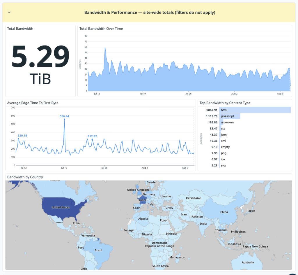
Geographical distribution provides an additional layer of context. On an international site, a rise in bandwidth concentrated in a single country is not interpreted in the same way as a simultaneous increase across all markets.
Cross-referencing metrics to avoid drawing the wrong conclusions
A change observed in one metric often becomes clearer when viewed alongside another. This is particularly true for response time.
Is your CDN’s response time remaining stable?
The dashboard allows you to monitor the Average Edge Time To First Byte, the response time observed at the CDN level before the first byte is received.
The value lies not so much in knowing an isolated average as in seeing when it changes. Does a spike in response time coincide with a rise in traffic? Is the cache hit rate also changing? Is bandwidth increasing? Are HTTP responses remaining stable?
By correlating these signals over time, a performance degradation can be placed in context rather than analysed as an isolated event.
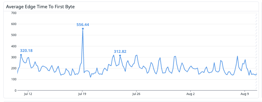
A spike can be compared with other signals available in the dashboard, such as changes in traffic, cache performance, bandwidth, or HTTP responses.
The same principle applies to the nature of your traffic.
What type of traffic is reaching your website?
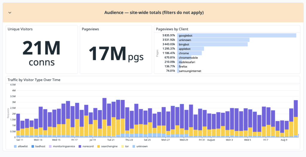
A sharp increase in the number of requests does not necessarily mean that the same number of additional users are visiting your website. Browsers, search engines, automated systems, and unidentified traffic can place very different levels of demand on your infrastructure.
The Audience section helps put these volumes into perspective by showing unique visitors, page views, and the types of clients observed.
This makes it easier to distinguish an increase in actual user traffic from a change caused, for example, by search engines or automated systems.
The more precise the context, the lower the risk of drawing the wrong conclusion from a single KPI.
From immediate incidents to long-term trends
Understanding what is happening also means choosing the right time frame.
Adapt your analysis to the situation
An anomaly that appeared ten minutes ago and a gradual change that has been building for several weeks should not be analyzed in the same way.
The time selector lets you explore data ranging from just a few minutes to several months and quickly access common periods such as today, the current week, or the previous month.
The same dashboard can therefore be used to check what has just happened after a deployment, monitor a major commercial event, or step back and analyze a longer-term trend.
A spike during Black Friday should not be interpreted in the same way as a spike on an ordinary Tuesday morning. A short increase in bandwidth lasting a few minutes tells a very different story from a steady increase over the course of a month.
See more clearly to know where to act
Adding more metrics has never been enough to manage a website more effectively. What matters is being able to move quickly from a signal to an understanding of the situation: what changed? Where? Which traffic was affected? Which content? And since when?
The new Cloudflare CDN dashboard available in the Fasterize console brings together the key information you need to answer these questions more quickly and focus your analysis on the right areas.
This visibility becomes especially valuable when your website cannot afford to be a blind spot: during a product launch, media campaign, Black Friday, sales period, deployment, or major infrastructure change.
It allows teams to spend less time figuring out where to look and more time understanding what actually requires their attention.
This is also the direction in which the Fasterize console continues to evolve: giving you a clearer view of what is happening on your website, helping you understand where to focus your attention, and enabling you to move more quickly from observation to action.