


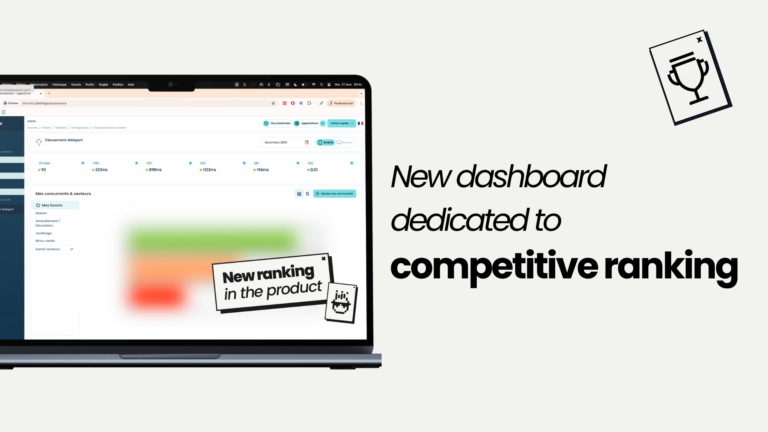
That is why today we are launching our Competitive Ranking Dashboard, directly integrated into the Fasterize console.
This new dashboard provides a more granular and strategic view of performance. It enables each user to compare their site, month after month, with direct competitors through the Performance Experience Index (PX Index), while tracking the evolution of their user experience.
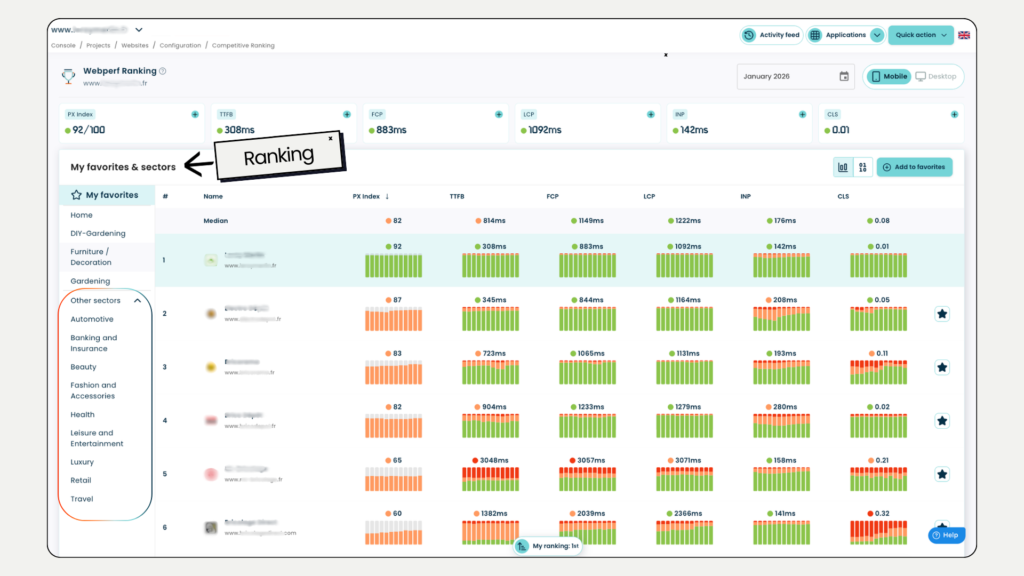
A performance view within your ecosystem
Optimising your site is essential.
But without a structured comparison point, it is difficult to assess your true level.
A good score may seem satisfactory, until a competitor progresses faster and captures more traffic, visibility or conversions. Conversely, performance considered average may actually be highly competitive in a less mature sector.
Context is what matters. You need to understand where you stand compared with your direct competitors, across the key metrics that genuinely impact user experience and SEO/GEO visibility.
Within this dedicated interface, each user can build their own competitive panel by adding the players that truly matter to their market. The benchmark is private, personalised and aligned with the real competitive environment.
Each month, the personalised ranking is updated with a refreshed PX Index and a clear view of performance evolution. At a glance, it becomes possible to measure your position against direct competitors, identify critical gaps and understand which metrics make the difference.
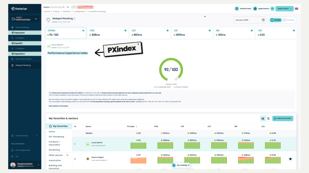
Scored from 0 to 100, the PX Index measures the real share of users benefiting from a good experience, based on Chrome UX Report data. Updated monthly and stored historically, it enables you to track real exposure to quality experience over time.
Behind this trajectory lie very tangible business stakes: SEO and GEO visibility, conversion rates, engagement and revenue.
To explore the PX Index methodology in greater depth, we invite you to read our dedicated article.
A detailed view of user experience
This new space goes beyond simply displaying a ranking: it provides deeper analysis.
Each key metric in the user journey (TTFB, LCP, INP, CLS and FCP) is broken down to show the share of good, average and poor experiences.
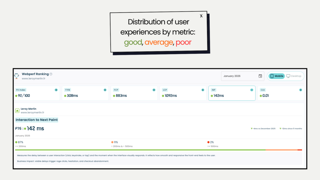
Rather than simply checking whether a threshold has been met (75th percentile), you can understand how experience is truly distributed across your site:
- What proportion of users benefit from a smooth experience
- How many are exposed to friction
- How this exposure evolves over time
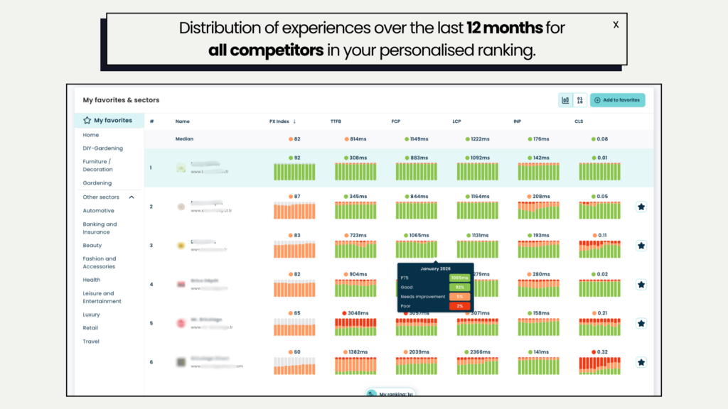
This granular view transforms prioritisation. Teams can precisely identify where degraded experience is concentrated, observe trends over 12 months and focus efforts on optimisations with the strongest business impact.
A micro and macro view to manage performance precisely
Comparison does not stop at direct competitors.
The new dashboard also provides access to sector rankings, including the Top 100 most visited sites in each vertical, to broaden the perspective.
This exclusive access enables you to:
- Understand trends within your sector
- Observe sector averages for each metric, with a macro view of digital maturity
- Refine priorities according to sector dynamics
This dual perspective allows more precise decision-making: within your direct competitive universe (micro view) and within the overall maturity of your sector (macro view).
A structuring product evolution
This dashboard marks a significant step in the evolution of our product.
Our objective is clear: to provide digital teams with greater visibility, enhanced monitoring and deeper insights to manage user experience within a real competitive context.
The Fasterize console now enables you to compare your user experience with that of your market and identify truly structuring performance gaps. For digital teams, this changes the approach:
- Decisions become data-driven
- Technical priorities are guided by concrete competitive gaps
- Performance becomes a strategic growth lever, aligned with competition and sector maturity
Fasterize is evolving the way digital performance is understood.
It is no longer simply about measuring indicators, but about having access to a structured, monthly updated competitive benchmark that is directly actionable.
Today, this Competitive Ranking Dashboard is exclusively available to Fasterize clients, as part of our continuous monitoring approach.
However, if you are not yet a client, we will very soon open access to organisations wishing to understand their true position within their market.
What if you discovered your real market position?
Because today, the question is no longer simply whether your site is performant: but whether it is better than the rest.
If you would like priority access to your personalised dashboard: Join the early access list.