


“Why is my site slow on mobile?”
You’ve probably already noticed the difference in speed between pages on the same website on mobile and desktop. HTTP Archive, which monitors the state of the web, reports that a page takes 6.6s to load on desktop and… 19.7s on mobile (medians). However, in mobile situations, web users are even more impatient.
Yes, no one likes to wait, and even less so with a smartphone in hand. One study shows that 85% of mobile users expect a website to load faster on mobile than on desktop, and another reveals that 14% of online shoppers even expect pages to load instantly. And that’s just the beginning!
If the frustration caused by poor loading times is too great, mobile users are merciless: according to a study carried out by Google, 53% leave the website after 3 seconds if the page is not displayed, and are unlikely to return. The slowness of your web pages is therefore a risk for your sales, since, as Google points out, an extra second of loading time can reduce the conversion rate by 20%.
When you consider that more than halfthe world’s web traffic comes from mobile devices, and that 4/10 French web surfers use their mobiles exclusively to surf the web, having a fast mobile site should be a priority.
Although website performance is harder to improve on mobile due to processor power and more random network conditions, there are optimization techniques within reach to optimize your speed and UX. Let’s see which ones.
Dimensions and formats: adapting images for mobile
Optimize and automatically resize images for mobile devices
Images account for an average of 50% of the weight of web pages, which on average weigh 2 MB. By optimizing your images, it goes without saying that page weight will be reduced, and the speed of your site improved.
By compressing images for faster mobile display, you can reduce their weight by up to 70% without losing visual quality.
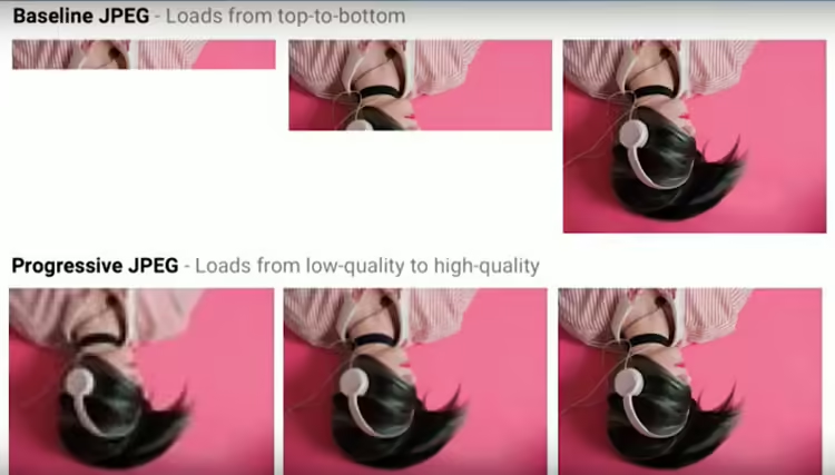
As with the desktop version of your site, also think about lazyloading,inlining small images and Progressive JPEG to save even more precious milliseconds on your loading times.
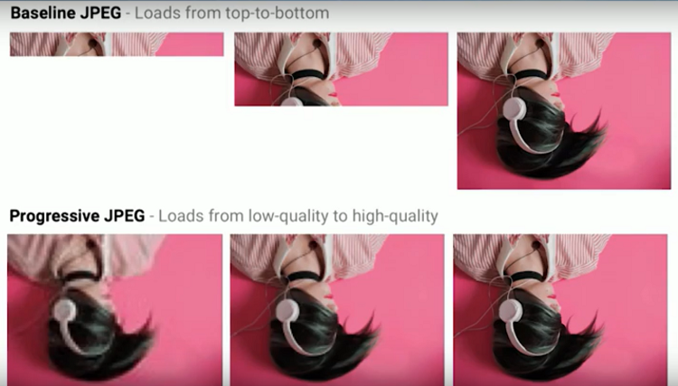
Loading an image with Progressive JPEG
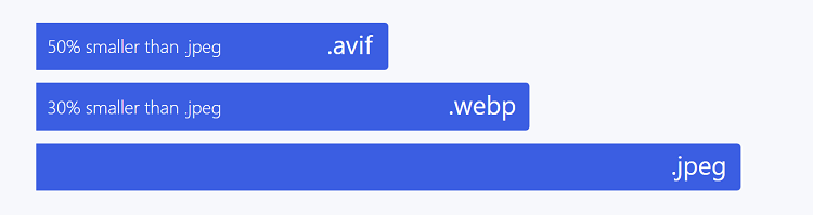
You may be wondering which image format is the most effective for a good PageSpeed score? The WebP format offers excellent performance.
Without loss, it’s 26% lighter than PNG, and with loss it’s 25 to 34% lighter than JPEG for the same perceived quality. However, it is not suitable for all situations (especially if your images contain text, or if you wish to apply progressive loading techniques).
Another format you may already have heard of is AVIF, which offers increasingly interesting performance:
The more compressed an image, the more power a device will need to decompress it. This is a parameter to be taken into account when defining how to serve images to the browser, depending on the mobile user’s equipment.
For a better user experience, also consider automatically resizing your images to fit your visitors’ screen size. Whether you’re talking about resizing or cropping to fit the viewport size , it’s in your interest to ensure that this operation is carried out on the server or CDN side, so that the browser doesn’t have to consume CPU to do it.
Adaptive design: managing templates
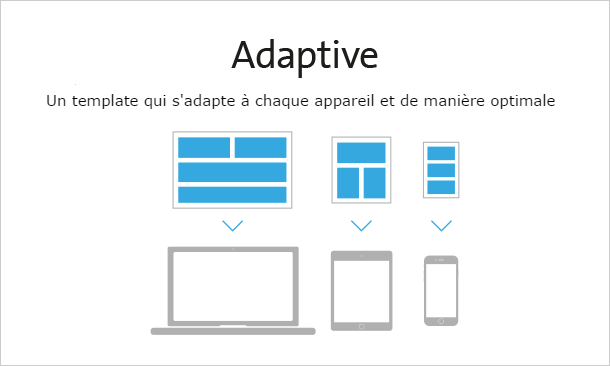
While speed is the No. 1 UX requirement of mobile users, adapting pages to the screen is also one of the criteria used to assess the quality of a website.
Here’s what you need to think about for a site designed using adaptive design (not to be confused with responsive design):
- the management of different page templates for different screen sizes, to ensure that your server sends elements in the right dimensions to the browser (in adaptive design, the choice of template is made at server level thanks to the HTTP User-Agentheader ). For example, you may decide to display an image rather than a video, or a widget on a cell phone if the network isn’t very powerful (our engine makes it easy to manage these different templates);
- cache management (which we’ll look at a little later), so that your server also sends the correct version of the cached page according to screen size.
Minimizing JS / CSS / HTML files
What is minification? This technique is beneficial on both mobile and desktop devices: it involves removing all unnecessary characters and spaces from the HTML, JavaScript or CSS code of a web page. As a result, the code is lighter, and so are the pages.
Concatenate JS and CSS files
After minification, here’s another best practice for reducing page weight: concatenating CSS and JavaScript files. This reduces the number of total requests, and the fewer the requests, the faster a page can be served by the browser. Indeed, if the browser spends less time requesting information from the server and waiting to retrieve it, it can display the page faster.
Compressing HTML, CSS and JS resources
Compress your HTML, CSS and JS resources to make them even lighter. There are several formats and levels of compression available, so you’ll need to choose the one best suited to your needs and configuration.
The Gzip compression format offers very good performance, but the nec plus ultra is now Brotli. At one of our customers, for example, this format reduced the weight of CSS files by 12% compared to Gzip, and LinkedIn even saw a 30% improvement thanks to this compression format.
Gzip offers 6 levels of compression, while Brotli offers 11. But should we go for the highest level of the best-performing format? Not necessarily. Indeed, while Brotli’s maximum compression level allows you to keep your resources as light as possible, it also requires more compression time. So, depending on your resources and context, there’s a balance to be struck.
In addition, Brotli is not supported by all mobile browsers, and this format implies updating your server, reconfiguring it, and generally reviewing the resource generation process. You should also be aware that Brotli is only supported in HTTPS (if you haven’t yet migrated , here’s a detailed guide).
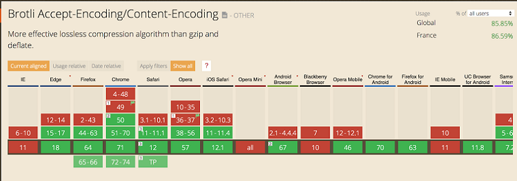
Overview of Brotli support by web browser
As you can see, resource compression is essential, but it also requires technical expertise if it is to move in the right direction and not be counter-productive.