


Here’s a guide to techniques for avoiding Layout Shifts (sudden changes in the layout of elements on the screen), in order to improve the user experience.
Layout shifts can be disruptive for users; for example, if you’re reading an article, elements suddenly change place and you then have to search for where you were in your reading. This is very common on web pages, and especially annoying when you’re browsing news or trying to click on the “Search” or “Add to cart” buttons.
These phenomena generally occur because visible elements are forced to move to make way for a new or resized element on the page.
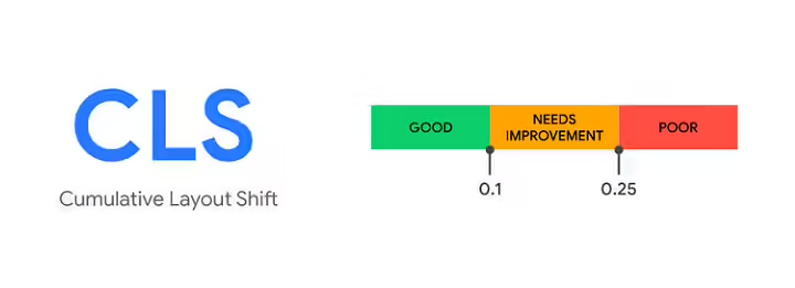
Cumulative Layout Shift (CLS) – a Core Web Vital metric – assesses content instability by summing the Layout Shift scores generated by layout changes that occur after 500 ms following a user action. It measures the amount of visible content shifted in the viewport, as well as the distance traveled by these elements.
This guide details the common causes of Layout Shift, and how to improve the user experience by reducing these unexpected layout changes.
The most common causes of poor CLS, which we will explain in detail, are :
- dimensionless images
- dimensionlessads, embedded elements and iframes
- Dynamically integrated content
- FOIT / FOUT web fonts
- Actions waiting for a network response before updating DOM
(Editor’s note: we regularly feature techniques and tips to help you improve all your webperf metrics in our monthly newsletter, whichyou can subscribe to here).
Cumulative Layout Shift: the problem of dimensionless images
In short: always include width and height attributes on your images and video elements. Otherwise, reserve the required space with CSS aspect ratio boxes. This technique ensures that the browser can reserve the right amount of space during image loading.
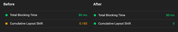
Images without specified width or height (source Google)
Images with specified width and height ( Googlesource )
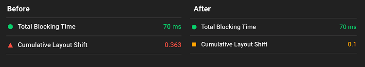
Lighthouse: impact of image size definition on CLS
History of image sizing
In the early days of the web, developers added width and heightattributes to their <img> tags to ensure that sufficient space would be provided on the page before the browser began retrieving images. This minimized the need to rearrange elements, and therefore unwanted movements.
[pastacode lang=”markup” manual=”%3Cimg%20src%3D%22puppy.jpg%22%20width%3D%22640%22%20height%3D%22360%22%20alt%3D%22Puppy%20with%20balloons%22%3E” message=”” highlight=”” provider=”manual”/]
You’ll have noticed that width and height above don’t include units. These “pixel” dimensions ensured a 640×360 location. The image then had to stretch to fit this space, whether or not the true dimensions corresponded.
When Responsive Design was introduced, developers began to abandon width and height and use CSS to resize images instead:
[pastacode lang=”javascript” manual=”img%20%7B%0A%C2%A0width%3A%20100%25%3B%20%2F*%20or%20max-width%3A%20100%25%3B%20*%2F%0A%C2%A0height%3A%20auto%3B%0A%7D” message=”” highlight=”” provider=”manual”/]
One of the disadvantages of this approach was that space could only be allocated to an image once it had started downloading, and the browser could determine its dimensions. As images loaded, the page reorganized itself according to their appearance on the screen. Text could then appear in the window, making for a very poor user experience.
This is where the aspect ratio comes in. The ratio of an image is the relationship between its width and height. This ratio is generally expressed as two numbers separated by two dots (e.g. 16:9 or 4:3). For an x:y ratio, the image is x units wide and y units high.
This means that if we know one of the dimensions, the other can be determined. For a 16:9 aspect ratio as follows:
- If chien.jpg has a height of 360 px, the width is 360 x (16/9) = 640 px
- If chien.jpg is 640 px wide, the height is 640 x (9/16) = 360 px
Knowing the height/width ratio enables the browser to calculate and reserve sufficient space for the height and associated area.
Best practices for managing theaspect ratio of images
Modern browsers now define the default image ratio as a function of the width and height attributes, so it’s necessary to define them to avoid Layout Shifts. Thanks to the CSS Working Group, developers just need to define width and height normally:
[pastacode lang=”markup” manual=”%3C!–%20set%20a%20640%3A360%20i.e%20a%2016%3A9%20-%20aspect%20ratio%20–%3E%0A%3Cimg%20src%3D%22chiot.jpg%22%20width%3D%22640%22%20height%3D%22360%22%20alt%3D%22Chiot%20dans%20l%E2%80%99herbe%22%3E” message=”” highlight=”” provider=”manual”/]
… and theUA stylesheets of all browsers then add a default aspect ratio based on the width and height attributes of existing elements:
[pastacode lang=”javascript” manual=”img%20%7B%0A%C2%A0%C2%A0%C2%A0aspect-ratio%3A%20attr(width)%20%2F%20attr(height)%3B%0A%7D” message=”” highlight=”” provider=”manual”/]
This allows you to define a ratio based on the width and height attributes before loading the image, and have this information available at the very start of layoutcalculation . As soon as an image is defined as having a certain width (e.g. width: 100%), the ratio is used to calculate the height.
Tip: If you’re having trouble calculating the ratio yourself, this tool will help.
The changes inaspect ratio calculation are present in Firefox and Chromium and are coming to WebKit (Safari).
To go further on the subject of aspect ratios, and to think about responsiveimages , take a look at jank-free page loading with media aspect ratios.
If your image is in a container, you can use CSS to resize the image to the width of the container. We define height: auto; to prevent the image height from being a fixed value (e.g. 360px).
[pastacode lang=”javascript” manual=”img%20%7B%0A%C2%A0height%3A%20auto%3B%0A%C2%A0width%3A%20100%25%3B%0A%7D” message=”” highlight=”” provider=”manual”/]
What about responsive images?
When working with responsive images, the srcset attribute defines what the browser will choose as an image and at what dimensions. To ensure that the <img> width and height attributes can be set, each image must use the same aspect ratio. For example:
[pastacode lang=”markup” manual=”%3Cimg%20width%3D%221000%22%20height%3D%221000%22%0A%C2%A0%C2%A0%C2%A0%C2%A0%C2%A0%C2%A0src%3D%22puppy-1000.jpg%22%0A%C2%A0%C2%A0%C2%A0srcset%3D%22puppy-1000.jpg%201000w%2C%0A%C2%A0%C2%A0%C2%A0%C2%A0%C2%A0%C2%A0%C2%A0%C2%A0%C2%A0%C2%A0%C2%A0puppy-2000.jpg%202000w%2C%0A%C2%A0%C2%A0%C2%A0%C2%A0%C2%A0%C2%A0%C2%A0%C2%A0%C2%A0%C2%A0%C2%A0puppy-3000.jpg%203000w%22%0A%C2%A0%C2%A0%C2%A0%C2%A0%C2%A0%C2%A0%C2%A0%C2%A0%C2%A0%C2%A0alt%3D%22Puppy%20with%20balloons%22%2F%3E” message=”” highlight=”” provider=”manual”/]
What about the design ?
In terms of UI design, pages may require a cropped photo on narrow screens (mobile) and a full image on a desktopscreen .
[pastacode lang=”markup” manual=”%3Cpicture%3E%0A%C2%A0%3Csource%20media%3D%22(max-width%3A%20799px)%22%20srcset%3D%22puppy-480w-cropped.jpg%22%3E%0A%C2%A0%3Csource%20media%3D%22(min-width%3A%20800px)%22%20srcset%3D%22puppy-800w.jpg%22%3E%0A%C2%A0%3Cimg%20src%3D%22puppy-800w.jpg%22%20alt%3D%22Puppy%20with%20balloons%22%3E%0A%3C%2Fpicture%3E” message=”” highlight=”” provider=”manual”/]
It’s quite possible that these images have different proportions, and browsers always evaluate the most efficient solution, even if the dimensions have to be specified on all sources. Until a solution is defined, reorganization of the elements is always possible.
Cumulative Layout Shift: the problems posed by dimensionlessads, embedded elements and iframes
Advertisements and CLS
Advertising is one of the main causes of Layout Shift on web pages. Ad networks and publishers often support dynamic ad sizes. Ad sizes boost performance and revenue through higher click-through rates and greater bidding competition. Unfortunately, this can lead to a degraded user experience as ads push viewed content to the bottom of the page.
Over the course of an ad’s lifecycle, a number of points can introduce a change in layout:
- when a site inserts anadcontainer in the DOM
- when a site resizes the container with proprietary code
- when the ad tag library loads (and resizes the container)
- when the ad fills a container (and changes dimensions if the final ad is a different size).
The good news is that it’s now possible for sites to follow best practice in reducing the Layout Shift associated with advertising:
- Statically reserve space for advertising.
- In other words, style the element before the ad tag library is loaded.
- If you’re placing ads in the content stream, make sure to avoid content shifts by reserving the size of the slot. These ads should not cause layout changes if loaded outside the viewport.
- Take care when placing floating ads near the top of the window.
- In the example below, we recommend moving the ad below the “World vision” logo, and make sure you reserve enough space for the placement.
- If no ad is displayed while its location is visible to the user, avoid deleting this location and display a placeholder instead.
- Eliminate Layout Shifts by reserving the largest possible size for the ad space.
- However, there is a risk of leaving an empty space if the dimensions of the ad are smaller than the intended placement.
- Choose the most likely size for the ad space based on historical data.
On some sites, reducing the space at the outset may limit Layout Shifts if there’s little chance of the ad space being filled. In any case, it’s not easy to systematically define the exact size, unless you control the ad yourself.
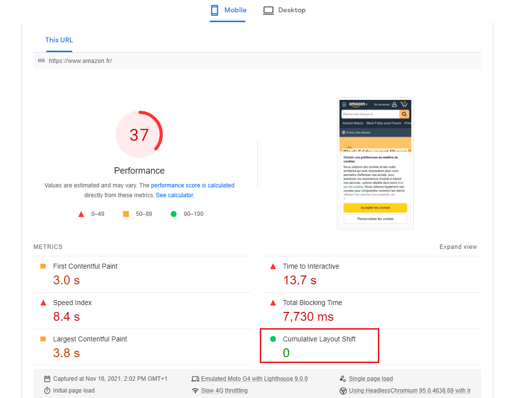
Ads without sufficient space reserved (source Google)
Ads with sufficient reserved space (source Google)
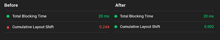
Lighthouse: impact on CLS of reserved banner space
Static space reserved for advertising
Statically assign a style to the DOM elements of your ad placement, with the same size as that passed to your ad tags. This can help ensure that the library doesn’t introduce changes to the layout of page elements during loading. If you don’t, the library may change the size of the location after the page has been laid out.
Please also take into account ads smaller than the reserved space. If a smaller ad is served, the editor can assign a (larger) style to the container to avoid Layout Shift. The disadvantage of this approach is that it increases the amount of empty space, so keep this principle in mind.
Avoid placing ads at the top of the viewport
Ads at the top of the viewport can cause a greater layout shift than those in the middle. This is because ads at the top of the viewport generally have content that will expand from top to bottom, so more elements will have to move to the bottom. Conversely, ads located towards the middle of the viewport potentially result in fewer changes to the web page.
Embedelements, iframes and CLS
Widgets enable you to embed content in your page (e.g. YouTube videos, Google Maps, social network posts, etc.). These integrations can take several forms:
- Replacement of HTML code or JavaScript tags with visual elements
- InlineHTML snippet
- embeddediframe
It’s not always possible to predict the size of these embedded elements in advance (for example, in the case of a publication on social networks: does it have an embedded image? A video? Several lines of text?) As a result, platforms offering embed elements don’t always reserve enough space for them, which can result in a Layout Shift when the page loads.
Embed without placeholder ( Googlesource )
Embed with placeholder ( Googlesource )
Lighthouse: impact on CLS of a reserved space for the embed element
To get around this problem, you can reduce CLS by pre-calculating enough space for embedded elements with reserved or spare space. Here’s a workflow you can use for such embeds:
- Raise the height of your final embed by inspecting it with your browser’s development tools.
- Once the embed element is loaded, thecontainediframe will resize to fit its content.
Take note of the dimensions and create a reserved space for the embed accordingly. You may need to take into account slight differences between ad sizes / placements provided using media queries.
Dynamic content and CLS
In short: avoid inserting new content on top of existing content, except in response to user interaction. This ensures that any layout changes that occur on the page are expected.
You’ve probably observed layout changes due to the user interface appearing at the top or bottom of the window when you try to load a site. As with advertisements, this often happens with banners and forms that alter the rest of the page content:
- Newsletter subscription
- Suggestions for related articles
- Push to install an application
- RGPD notice…
Dynamic content without reserved space (source Google)
If you need to display these elements in the user interface, reserve enough space for them in the viewport (for example, by using a reserved space or a UI skeleton, a simplified and stylized version of the layout) so that, when loading, the page content doesn’t move around unexpectedly.
FONTS that cause FOUT / FOIT
Downloading and rendering fonts can cause layout changes in two ways:
- The backupfont is replaced by a new one (FOUT – text flash without style)
- Invisible” text is displayed until a new font is rendered (FOIT – invisible text flash).
The following tools can help you minimize this:
-
- font-display lets you modify the rendering behavior of customfonts with values such as auto, swap, block, fallback and optional. Unfortunately, all these values (except optional) can cause elements to be rearranged on the page (Layout Shift) in one of the above ways.
- Font Loading API can reduce the time needed to retrieve fonts.
- Ndt: Fasterize offers a font optimization feature.
Since Chrome 83, Google recommends the following:
- Use <link rel = preload> on key fonts : a preloaded font will be more likely to arrive at First Painttime , in which case there is no layout change.
- Combine <link rel = preload> and font-display: optional.
See Prevent layout shifting and flashes of invisible text (FOIT) by preloading optional fonts for more on the subject of fonts.
CLS and animations
In short: prefer transform for animations, rather than property animations that trigger layout changes on the web page.
Changes to CSS property values may require the browser to react to these modifications. A number of values trigger reorganization of elements on the page, display and compositing such as box-shadow and box-sizing. A number of CSS properties can be modified more cheaply.
To find out more about CSS properties that trigger page layout, see CSS Triggers and High-performance animations.
Developer tools for evaluating Cumulative Layout Shift
A number of tools are available for measuring and optimizing Cumulative Layout Shift (CLS).
- Lighthouse supports CLS measurement via Lab data , and highlights the points that cause the most Layout Shift ( alsoPageSpeed Insights ).
- Performance panel in DevTools highlights layout changes in the Experience section from Chrome 84 onwards. The Summary view of a layout change record includes the cumulative Layout Shift score and a visualization of the areas affected.
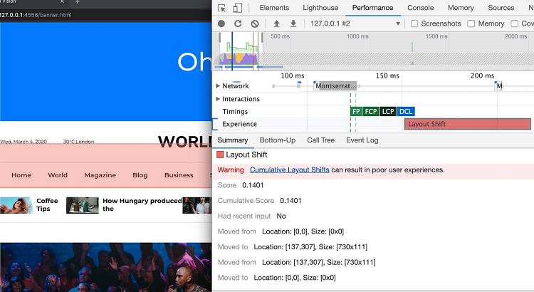
After recording a new track in Performance Panel, the Experience section displays a red bar representing a layout change.
By clicking on the record, you can explore the impacted elements.
Measuring Cumulative Layout Shift is possible in real-life conditions thanks to Chrome User Experience Report, which offers aggregated CLS values for a given site. CrUX CLS data is available via BigQuery, and a sample for observing CLS is also available.
Read also:

