









Anthony Barré was at We Love Speed 2019 to talk to us about the key principles of image optimisation and the techniques involved (the full talk is available
here on video). We’ll see that when it comes to optimising images to improve loading times, it’s not just about size, but also about context.
What does image compression involve?
Anthony Barré:
Image compression
is:
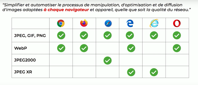
[perfectpullquote align="full" bordertop="false" cite="" link="" color="" class="" size=""] “Simplifying and automating the process of handling, optimising and delivering images tailored to each browser and device, regardless of network quality”
[/perfectpullquote]
That, at any rate, is the promise of image optimisation services. This principle includes resizing, but also applying compression based on perceived quality, or selecting the right image according to the browsing context: screen size, connection and device
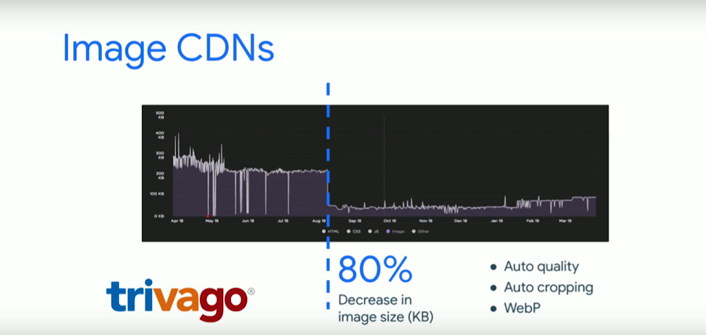
quality, and browser capabilities. These constraints must be taken into account when selecting the right image for the current browsing session. This is what image optimisation services offer, but you can also choose to implement these techniques yourself. In any case, when applied correctly, these optimisations deliver truly impressive results. For example, Trivago used an image optimisation service, which enabled them to reduce their file size by 80 per cent.
What happens when you optimise images?
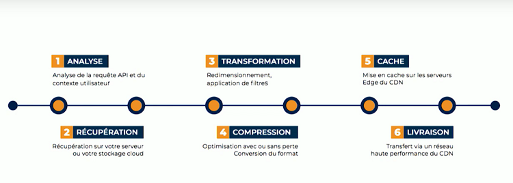
A. B.: The process involves six steps: analysis, retrieval from cloud storage or the source, transformation, compression, caching at the
CDN’s
edge, and delivery to the browser. At the retrieval stage, a problem often arises: the image must be high-resolution and uncompressed to ensure the highest possible quality, yet this original image is not always available.
Are all images optimised in the same way?
A. B.: No, and that’s actually the crux of the matter! Each compression format has its own characteristics. For example, compression can be lossy or lossless. It’s also important to note that each browser has its own capabilities and may or may not support certain compression formats. For example, WebP is supported by Chrome, Firefox and Edge, whilst Safari supports JPEG2000. Once again, the browsing context is key to defining the compression rules.
Furthermore, when we talk about image size, we often think in terms of the number of pixels, whereas the device’s processing power must also be taken into account for compression. In practical terms: the same image can be decompressed five times faster on a MacBook Pro than on a Samsung Galaxy S6. An optimisation service must factor in this parameter when serving the image. Finally, network quality is also a key factor in determining the level of compression required, even though this is still rarely taken into account by such services.
There are many contextual factors to take into account. How can we ensure the right image is displayed?
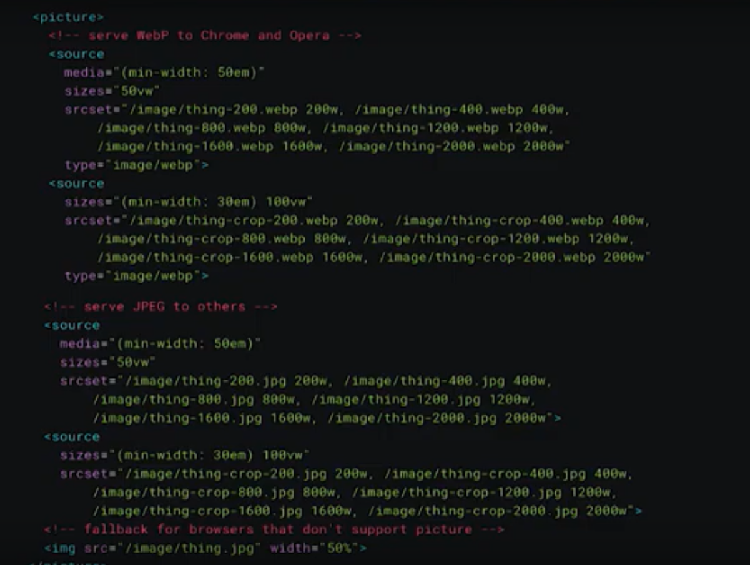
A. B.: It’s all down to the HTML code. However, the consequence of this vast amount of information is that the tags become very bulky. Ideally, a developer writes the simplest possible tag, such as <img src=”image.jpg”>.
With responsive design, these tags have become much more complex, featuring attributes such as
‘size’ or ‘srcset’, which
specify the list of possible sources. The tags then become difficult to maintain because you have to strike a balance between the number of images offered and a good cache hit ratio, whilst avoiding downloading an image that is too large in relation to its final size. To ensure an image is perfectly suited to browsing in all situations, the tag becomes unmanageable – and even more so for a CMS.
Even so, is it possible to reduce this complexity?
A. B.: Yes, by instructing the browser to send all the information directly to the image optimisation service. For example, we can ask the service to manage the width itself using a
‘size’
attribute, and do the same for all other elements: format, pixel density, compression. This is the principle behind HTTP content negotiation! So, when a browser sends information to the image service, it sends two headers: ‘user-agent’ to identify the browser and the device, and ‘accept’, which identifies all the supported formats, as I mentioned earlier. Based on this information, the image server deduces the supported formats, the pixel density, the screen size… but still does not know what image size should be displayed. In Chrome, using the client hints
approach, the browser is then asked to provide three additional pieces of information: the pixel density, the
viewport
size and the target image size, so that the server can identify which image to serve. Please note that, for data privacy reasons, client hints
are only supported on the main domain.
Network quality is also a contextual factor. How can we convey information about this?
A. B.: For this, we have the Navigation Information API,
available in JavaScript and within Service Workers. The information it provides on network characteristics can be taken into account directly by the image optimisation service, or via a JavaScript library that handles transforming the URL to add the contextual data.
Technically speaking, how do we ‘slimming down’ an image?
A. B.: Here we’re entering the realm of the human eye’s capabilities, and optimisation involves working within those limits. For JPEG or WebP formats, we start from the observation that the eye is more sensitive to changes in luminance than to changes in chrominance. The image is broken down into three layers, one of which contains luminance information that remains completely intact, whilst the colour information is modified without our eyes even noticing. It is this principle that enables what is known as ‘lossy compression’ whilst maintaining a decent appearance. But let us now turn to frequencies. The human eye is more sensitive to shapes and flat areas (low frequencies) than to fine details (high frequencies). Lossy compression algorithms therefore target the high frequencies to remove details without losing quality.
And how does the machine decide what to leave intact and what to ‘degrade’?
A. B.: To be optimised, images are divided into blocks and reconstructed by selecting which frequencies are retained in the compressed image compared to the original. Most of the time, JPEGs are optimised with a quality factor of 80 or 85; in other words, this is how the slider is set to remove high frequencies. As for display, a JPEG is traditionally loaded by building up the image from top to bottom. But with progressive JPEG, all the low-frequency blocks are loaded at the same time, and the high frequencies are then added:
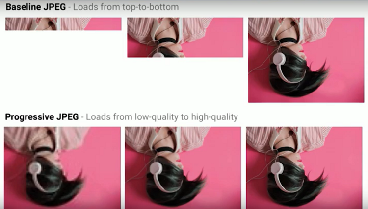 Full
Full
rendering usually requires 10 decompression passes; scanning scripts allow this to be reduced to 2 or 5 passes. Depending on the context, image optimisation services choose between four options: non-progressive,
steep progressive, semi-progressive and progressive, and incorporate this choice into their compression algorithms.
Is there one image compression format that’s better than another, and how should one choose?
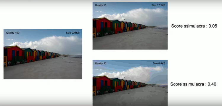
A. B.: Among the more recent formats, WebP is the leading choice. In lossless mode, it is 26 per cent smaller than PNG, and in lossy mode it is 25 to 34 per cent smaller than JPEG at equivalent perceived quality. However, it does not support progressive loading and requires chroma subsampling. It is therefore not suitable in 100 per cent of cases: for example, if there is text, the rendering will be too degraded; the algorithms take this into account. To choose a compression format, it is best to use an algorithm that compares artefacts in images, which indicates the perceived degradation. The most advanced one currently available is ssimulacara, which provides a ‘dis-similarity’ score between two images:
Some algorithms are also capable of analysing images to determine whether they contain a photograph or text, and whether or not to apply
chroma subsampling if the chosen format is JPEG… in order to adapt as effectively as possible to the context.
Regarding the final stage of the process: how is the image delivered?
A. B.: Delivery takes place via a CDN network, which serves images based on cache keys. These CDNs also need to be optimised to deliver the images. With HTTP/2, optimising the network layer can have a significant impact on the perceived speed. If the network layer is optimised with progressive streaming (to serve the first scans of progressive JPEGs quickly), the images fill the screen much faster:
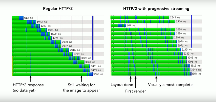
This criterion is important when choosing a service, which is why it is essential to ask yourself this question: is the network layer properly optimised?
So, what is the best way to improve web performance by optimising images?
A. B.: It’s a complex subject, but fortunately there are image optimisation services available to make the process easier! To implement these techniques yourself, I recommend using an algorithm based on artefact detection. And if you can afford it, the best option is to use an image optimisation service!
Would you like to find out what Fasterize can do to optimise your images, and discover our other front-end optimisation solutions?