


CSS optimization guide for optimal performance
Even in small quantities on a website, CSS files can slow down the loading of a page by the browser. This is especially true for users with low-performance mobile devices, and/or those with suboptimal network quality or limited data.
So, for an optimal user experience whatever the browsing conditions (network quality, computer or mobile model and size, browser, geographic area, etc.), optimizing CSS files is a must!
Let’s look at the challenges that CSS can pose for the speed of your site’s pages, and of course, how to solve them to optimize loading.
Loading web pages: how does CSS work?
CSS BLOCKS BROWSER RENDERING OF PAGES
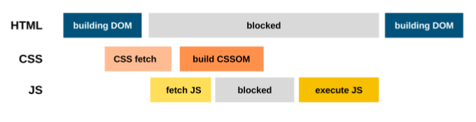
Whether it’s an HTML style tag or an external style sheet, the browser must parse the CSS before displaying content.
That’s because if the browser displays a page without CSS, and then a few moments later, a styled page, the unexpected change in content and layout will make for a poor user experience. This phenomenon has a name: Flash of Unstyled Content (FOUC).
When it occurs, your Cumulative Layout Shift , one of the Core Web Vitals that Google considers to evaluate the quality of your user experience, can be degraded.
CSS CAN ALSO BLOCK HTML PARSING
Also, even though the browser doesn’t display any content until it’s finished parsing the CSS, it continues to process the rest of the HTML. However, scripts can block the parser unless the browser is told to process them later, which is done by marking them defer or async .
Since a script can impact the content of the page and the rest of the code, the browser needs to be careful about when that script executes.
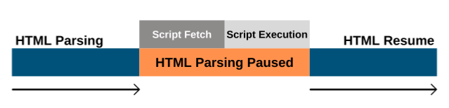
While a page is loading by a browser,
how a script can block the HTML parser
As you can see, since scripts can impact the styles that apply to a web page, if the browser is still parsing or processing a CSS, it will wait until this processing is complete before executing the script. In fact, the code analysis stops until the script is executed.
Therefore, CSS does not only block rendering , but depending on the order in which stylesheets and external scripts are found in the document, parsing of the HTML can also be blocked .
How and why CSS can block the HTML parser
So, to avoid blocking your browser from analyzing the code, you need to help it discover CSS as soon as possible, and optimize the prioritization of your resources. Good news for your webperf (and for your users): you can automate this step with the Fasterize engine which places the CSS file declarations at the beginning of the HTML code, before the script tags.
Now let’s move on to best practices for managing your CSS resources.
How to Optimize CSS to Improve Display Speed
OPTIMIZE CSS FILE SIZE: COMPRESS, MINIFY, AND CONCATENATE
Optimizing your assets – and CSS files are one of them – allows you to reduce the number of bytes transferred over the network, and therefore improve the speed at which exchanges are made between server and browser. This means that content can be displayed faster for your users – saving them time and maximizing the chances of keeping them engaged on your site.
To save time too, you can very easily automate this task as well, and take advantage of the most efficient formats and techniques thanks to our frontend optimization engine .
But you may be wondering what these different resource optimization techniques are all about? Here are some details on the terminology
- Compression : The most interesting formats for compressing resources are currently Gzip and Brotli (and you can activate them in one click with Fasterize).
- Minification : This involves removing unnecessary spaces and characters in the code to make files lighter.
- Concatenation : This is about reducing the number of files to reduce the total number of requests (a technique also useful for JavaScript). Note that our engine allows you to transform CSS @import directives, which we will discuss a little later.
REMOVE UNUSED CSS
If you’re using CSS frameworks , chances are your code will have unused CSS (unless you only include necessary components), and it can add up over time.
Removing this unused CSS usually requires manual intervention, a tedious and complex job. It is then necessary to examine the entire site from every angle, in all possible conditions, by executing all the scripts likely to modify the styles… then test the site to ensure that there is no regression in the visual quality of the interface… It is a real ant’s work!
One approach taken by modern JavaScript frameworks such as React or Vue.Js is to embed CSS directly into components written in JavaScript.
This approach makes it easier to maintain the CSS used on the site, and therefore reduces the presence of dead CSS code. On the other hand, the CSS is discovered late, when the JavaScript is loaded by the browser. This can have a negative impact on the first rendering of the page.
PRIORITIZE CRITICAL CSS
Critical CSS is a technique that extracts and embeds CSS for above-the-fold content. Inserting the extracted styles into the <head> tag of the HTML document eliminates the need for an additional request to retrieve these styles and speeds up rendering.
Tip: To minimize the number of request exchanges needed to render the first few bytes on a page, keep above-the-fold content below 14 KB (compressed).
However, note that defining critical CSS is not straightforward, because there is no “universal” fold since devices and screen sizes are multiple. So you have to make assumptions about the fold position, and this is even more complex for dynamic sites.
Rest assured, even if imprecise, this technique can bring performance improvements, and we can automate it.
LOADING CSS ASYNCHRONOUSLY
We’ve seen how to handle critical CSS. Now what about non-critical CSS?
It’s best to load the rest of the CSS (the non-critical part) asynchronously. The way to do this is to set the “link media” attribute to “print”:
The print media type defines the style sheet rules for when the user tries to print the page, and the browser loads this style sheet without delaying the rendering of the page. Applying this style sheet to all media (i.e. screens, not just print) uses the onload attribute to set the media to all when the style sheet has finished loading.
Another option is to use <link rel= »preload »> (instead of rel= »stylesheet » ) to achieve a similar schema as described above, and switch the rel attribute to stylesheet on the Onload event .
However, this technique involves some limitations to take into account:
- Browser support for preloading is still not optimal, so a polyfill (or using a library like loadCSS ) becomes necessary to apply the stylesheet across all browsers.
- Prefetching allows files to be fetched very early, with the highest priority, which may have the effect of limiting other essential downloads.
If you want to benefit from the priority fetching offered by preload (in browsers that support it), the creators of loadCSS recommend a combination with the first pattern, like this:
OPTIMIZE CSS ANIMATIONS
When you animate elements on a page, the browser often has to recalculate their positions and sizes in the document, which triggers potential layout changes (we’ve already seen the impact on CLS). Also, the larger the layout structure, the longer the layout calculations take.
So when animating elements, it’s essential to minimize layout and display recalculation. Not all CSS animation techniques are created equal, and modern browsers allow for more powerful animations with position , scale , rotation , and opacity :
- Instead of changing the height and width properties , use transform: scale() .
- To move elements, avoid changing the top , right , bottom , or left properties and use transform : translate() instead .
- If you want to blur the background, consider using a blur image and changing its opacity.
Focus: The contain and @import properties
The CSS contain property tells the browser that the element and its descendants are considered independent of the document tree (as much as possible). It isolates a subset of a page. The browser can then optimize the rendering (style, layout, and display calculation operations) of the independent parts of the page for better display speed.
This contain property is useful on pages that contain many independent widgets . Its use prevents changes to individual widgets from having side effects outside the widget’s bounding box . However, a site that is primarily static content will benefit little from this strategy.
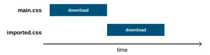
Also, avoid using @import in CSS files because this rule slows down rendering. Why? Because the browser has to first download the CSS file to discover the imported resource, and then make another request to download it before rendering.
If you have a stylesheet that contains @import url(imported.css) , the cascading network model looks like this:
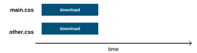
Loading style sheets into link elements allows requests to be processed in parallel:
FONTS: OPTIMIZE FONT LOADING WITH CSS
Avoid Flash Of Invisible Text while loading fonts
Because of their size, font files take a long time to load. To fix this, some browsers hide the text until the font loads, which causes the “ Flash Of Invisible Text ” (or FOIT).
To avoid this FOIT, you can display the content earlier on your pages by using a system font (pre-installed on their device). Then, once the font file is loaded, the browser replaces the system font with the font defined in your CSS. This phenomenon is called “ Flash Of Unstyled Text ” (or FOUT).
To display text early, even before fonts are loaded , you can use font-display , an API to specify your font display strategy . Using font-display with the value swap then tells the browser that text using that font should be displayed immediately with a system font.
To make it easier to implement this technique, please note that our engine provides a feature to optimize the loading of Google fonts : the browser can display the text content earlier thanks to the swap option , and the CSS loaded asynchronously gives time to other resources displayed in the viewport to load.
Use variable fonts to reduce file size
Also save time and weight with variable fonts! They allow you to embed many variations of the same typeface in a single file, rather than having a separate font file for each width, weight, or style. They allow you to access all the variations of a given font file using CSS and a single @font-face reference .
Variable fonts can significantly reduce file sizes when you need multiple variations of a font. Instead of loading regular/bold/italic versions… you can load a single file containing all of this information.
The impact of CSS selector structure
The structure of CSS selectors affects how quickly the browser can read them. It’s a complex topic, and if you want to dive deeper into the technical details, we recommend reading this article or this one .
CSS and loading speed: in short, automate!
JavaScript scripts and images are often the focus of attention to improve the performance of a website, but you should also pay attention to your CSS files, as their optimization is essential for a better user experience!
Indeed, if your CSS files are too large and poorly prioritized, the loading speed of your pages takes a serious hit.
To improve your UX, reduce your bounce rates, and increase your conversions, consider minifying and concatenating your CSS, and prioritizing critical CSS. These are techniques you can automate with the Fasterize engine.
Result: your site loads faster with less technical effort required, your users are more satisfied and engaged, and your turnover benefits.
To delve deeper into the subject of loading speed and its many levers,
decipher and analyze your performance with this white paper:

