


There are the 7 wonders of the world, the 7 colors of the rainbow, the 7 days of the week and the 7 deadly sins. Now we’ve added the 7 myths of mobile performance to the list.
According to a recent study, in Q1 2015 alone in France, mobile terminals (smartphone, tablet) captured 40% of traffic to merchant sites (vs. 31% in Q1 2014) and 23% of online purchases (vs. 17% in Q1 2014).
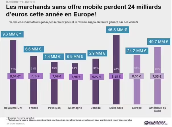
According to the same study, mobile strategies could bring French merchants 6.6 billion euros.
In short, mobile is THE lever to pull. We’re not teaching you anything.
But how do you launch a mobile site that appeals to mobinauts? What are the pitfalls to avoid? What are the common misconceptions?
It’s our turn to dispel the myths!
1. Mobile users are patient!
Did you know that for 41% of mobile users, speed is a priority?
71% expect a web page to load as quickly on mobile as on PC. But 46% say that sites generally load more slowly on mobile than on PC.
Nearly 60% of mobile users believe that a web page should load in less than 3 seconds on a mobile device. Another 74% are willing to wait up to 5 seconds. After that, they prefer to leave the site.
2. A responsive site is necessarily fast
No, unfortunately, a responsive site isn’t always fast… On the contrary.
According to this study, 72% of RWD sites deliver the same number of Kb, regardless of screen size or connection (ADSL, 4G, Edge, etc.).
So obviously, this creates some performance problems.
But that doesn’t mean you need to create a sub-domain like m.votresite!
On the contrary, in these days of sharing everything on social networks, it’s better to have just one URL.
But that doesn’t mean that a URL should always point to the same page, or that every device should download the same resources.
3. Desktop and mobile designs follow the same rules
Of course, you have a graphic charter to respect. But you need to know how to compromise.
Let’s take the example of fonts: not all browsers support all fonts, and downloading them can get in the way (and slow down page loading).
The loading of your pages, and more particularly your text, will then be divided into 3 phases:
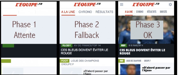
- 1st phase: the text is loaded but remains invisible because the browser doesn’t detect the requested font.
- 2nd phase: the browser ends up displaying the text, but with the wrong font.
For this to happen, you must first specify in your code fonts that are graphically close to the font you want to use and that are found by default in all browsers.
This will be reflected in your code by a tag such as: font-family: “Trebuchet MS”, Verdana, Arial, Helvetica, sans-serif; - Phase 3: The text appears as it should, and the site looks almost exactly as it did on the mock-up. All that’s left is to hope that your user hasn’t already left your site.
For more information, see this article >>.
So make the necessary compromises to keep your site as close as possible to your graphic charter, without sacrificing performance (and therefore user experience).
4. More widgets = better performance
There are two opposing definitions of performance in this equation.
Certainly, your widgets will enable you to gain in engagement (social buttons), data analysis (analytics and/or AB testing) or even revenue (banner ads). So yes, in a sense, you’re gaining in performance.
But the technical performance of your site will really suffer. The more widgets you have to download, the longer your mobile site will take to load.
And slow sites mean lower conversion rates.
In fact, site speed directly benefits the conversion rate, and to a far greater extent on mobile than on desktop.
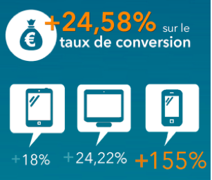
Source: A/B test carried out in May 2014 for a site whose loading time was reduced by 13% and Speed Index by 50%.
In conclusion, over-optimization (via widget integration) can wipe out the performance of your mobile site, and to a far greater extent on mobile than on desktop (requests take longer to download due to latency). So “more widgets” doesn’t mean “better performance”. CQFD.
5. Mobile users will stay on your mobile site
When you create a mobile site, you hope to improve the user experience for mobile users. Why else?
And yet… many mobile users today abandon a mobile site in favor of the classic site.
The reasons for this are many and varied:
- the mobile site doesn’t meet users’ expectations:ertainly, the mobile site needs to be streamlined both graphically and ergonomically. However, a mobile user will not look for the same information on a mobile site as on a desktop site. Take the example of a restaurant. Mobile users will be looking for opening hours, an address and the ability to make reservations easily and with a single click, rather than a detailed presentation of the restaurant’s history or videos.
- poor device detection: some sites link to the mobile site even though the user is browsing from a tablet. Even though they’re on the move, users will prefer to consult the more complete desktop site from their tablet.
- the page takes too long to load,
- difficulty navigating the page,
- concerns about the use of payment information,
- or the possible use of personal information.
6. 4G is as good as ADSL
Really?
Here are the average speeds in France for ADSL and mobile connections:
- average ADSL download speed: between 5.7 Mb/s and 6.54 Mb/s
- average 3G download speed: between 3.92 Mb/s and 7.06 Mb/s
- average 4G downlink: between 18 Mb/s and 36 Mb/s
Source :
The Barometer of fixed Internet connections in mainland France for the 1st quarter of 2015.
Mobile Internet Barometer in France, 2nd quarter 2015
Admittedly, 4G far outstrips ADSL in terms of throughput.
Even so, regular mobile users have seen that the reality of mobile browsing doesn’t reflect these figures, and these speeds remain largely theoretical. There are two simple reasons for this:
- on the one hand, mobile users share the operators’ antennas
- secondly, the biggest constraint when loading a web page from a cell phone is network latency.
This latency currently accounts for a significant proportion of loading time, and is difficult to improve since it is directly dependent on the infrastructures put in place by ISPs.
That’s why you need to reduce the number of requests and page weights on your website as much as possible: you’ll save bandwidth.
7. A CDN has just as much impact on mobile as on desktop
Once again, this is a myth. A CDN doesn’t have as much impact on mobile browsing as it does on desktop.
We carried out a test: we measured the differences in gain brought about by a CDN on a desktop and mobile e-commerce site.
We chose to focus on the Start Render (the moment when the white page gives way to the first elements of the web page) as it is the metric most representative of the CDN’s work.
On the desktop site, the CDN brought the Start Render forward from 7.2 seconds to 5.4 seconds. A gain of 24%.
On the mobile site, the CDN advanced the Start Render from 9.3 to 7.5 seconds. A gain of only 19%.
The performance gains generated by CDN on mobile are therefore more limited than those on desktop.
This can be explained by the fact that latency and bandwidth on mobile networks are the main constraints on mobile performance (see point number 6).
The French m-commerce market is set to almost double in 2015. It’s an understatement to say that e-tailers are expected to focus on the performance of their mobile sites at the end of the year.
Now that we’ve revisited a few myths, we hope you’ll be able to see your mobile strategy more clearly, and that it will help you boost your sites and your sales!