
Is your site Mobile First? You have certainly already experienced this: the speed of the pages varies depending on the browsing conditions. On a recent desktop computer, they are displayed faster than on an entry-level 3G mobile. How to explain this phenomenon and how to improve your performance? For your UX, SEO, and conversion rates, let’s see why it’s essential – but also more difficult – to speed up a mobile website. And let’s also see why you have to work hard for a fast site on mobile, to satisfy your users and Google.
The challenges of a Mobile First site to satisfy impatient mobile users (and Google)
Mobile users are even more impatient than desktop users. Remember that according to a Google study, 53% of mobile users leave a page if it takes more than 3 seconds to load. Also, 75% consider that speed is the # 1 UX criterion, ahead of the ease of finding information and the adaptability of pages on the screen.
But why are they in such a hurry? This can be explained by the fact that in a mobility situation, users seek a quick response to their needs: to know how the restaurant where they want to eat is rated, at what time is the next movie show they want to watch, in which store the product they want to buy is available …
Even being aware of the limitations of a mobile connection – 5G or 4G at best, 3G or even Edge – information needs to be readily available.
Besides the user experience, slow web pages are a risk to your business. In fact, the slower a site, the more it creates frustration, and therefore the desire to give up the buying or reading journey. For 54% of people polled in a Google study, the longer the wait on mobile, the more the frustration intensifies, and the revenue suffers. In practice, in the retail market, 1 more second of loading time on mobile can lower the conversion rate by up to 20%.
With the evolution of the quality of the network (5G, in particular) and of smartphones, mobile users are therefore more and more demanding, and they are also more and more numerous. This is why websites should be designed for them as a priority: Mobile First!
Extension of mobile coverage: more impatient mobile users … but also more numerous
Unsurprisingly, mobile and smartphone coverage continues to grow. According to a study conducted by Statista about French mobile coverage:
“The distribution of smartphones in France has experienced a meteoric rise between 2011 and 2018. Indeed, the share of French people with a smartphone has risen from 17 to 75% in eight years. Gradually, smartphones are supplanting so-called “classic” cell phones, they are no longer reserved for the wealthiest segments of the population or those most keen on new technologies, but are adopted by all social categories. “
Of all mobile users, nearly 80% are equipped with smartphones in 2019, a trend that should continue to take hold.
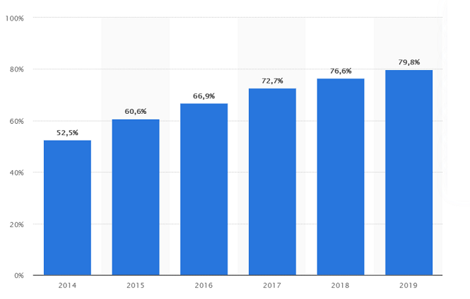
Evolution of smartphones penetration rate among mobile phones users in France from 2014 to 2019
On the other hand, the rate of equipment for tablets tends to level off with a drop of 2 points between 2017 and 2019:
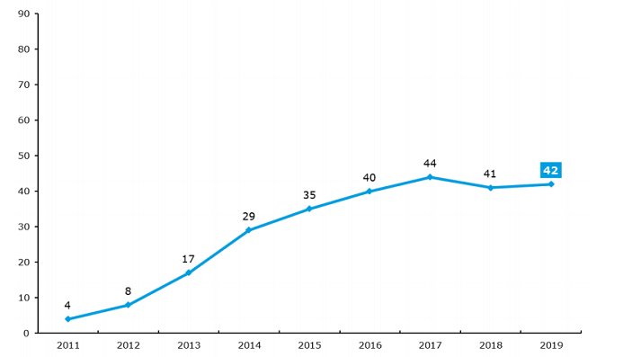
Evolution of the equipment rate for tablets in France in % (Source: Credoc)
According to certain sectors, the mobile can represent a preponderant part of the visits. This is particularly true for most of our customers in e-commerce but also in the media market, whose mobile traffic and transactions can reach up to 80% of total traffic.
As you can see, fast mobile pages are essential to address to the ever-increasing number of mobile users who doesn’t want to wait, and to improve your conversion rates, as well as your SEO, as Google favors Mobile First indexing since 2018, it’s even “part of life” according to John Mueller.
Google lists here the best practices for a Mobile-First site, including markup, metadata and structured data, images and videos, separate URL management…
What is Mobile-First indexing?
Mobile-first indexing means that Google primarily uses the mobile version of a web page for ranking and indexing.
If your website offers both a mobile and a desktop version, Google displays the mobile URL to mobile users and the desktop URL to desktop users, but in all cases, the mobile version is indexed.
Note that Mobile-First is a different concept from mobile usability. Indeed, as John Mueller reminds us, “A site may or may not be mobile usable, but it may still contain all the content we need for mobile-first indexing.”
Google lists here the best practices for a Mobile-First web site, including markup, metadata and structured data, images and videos, seperate URLs management…
However, speed of the pages on mobile is however more difficult to obtain than on desktop, let’s see why.
Why a website is slower on mobile
Overall, web pages need more time to display on mobile than on desktop, while the mobile is becoming more and more important in our daily use. Several reasons can explain this performance gap.
The technical capabilities of mobile phones
Depending on the power of the phone (CPU), the analysis time of JavaScript, CSS and rendering of the images that make up a page will be longer or shorter. On the graph below, you can observe the time required in milliseconds to analyze a 1MB JavaScript bundle (~ 250KB “Gzipped”), on desktop and on different ranges of mobile. To measure the “cost” of the JS analysis in terms of web performance, we must take into account the decompressed weight:
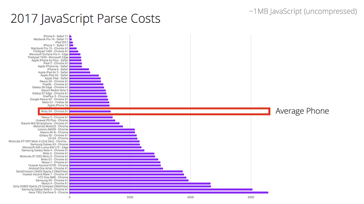
We see that the time to analyze / compile the code can be 2 to 5 times higher for mid-range mobiles compared to the most efficient devices (the study is from 2017).
A mobile phone has a less powerful processor than a desktop computer, which is part of the reason why the pages need more time to display. In addition, your users are not necessarily equipped with high-end mobiles, and you must take this into account for your pages optimization.
Thus, you must imperatively test your website on models that represent those of your users, and not only on recent and efficient ones!
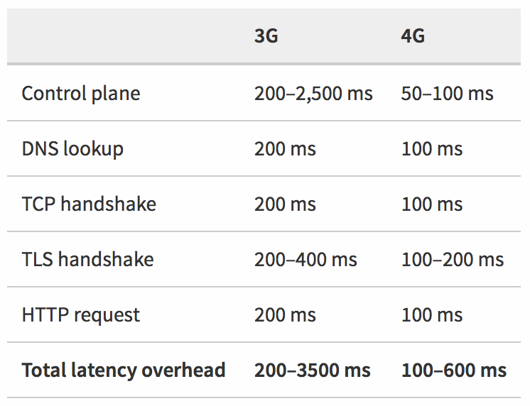
Latency and mobile networks saturation
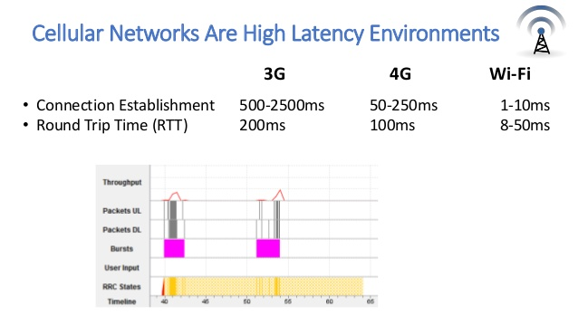
A 3G or 4G mobile connection is more unstable than a Wi-Fi (or even wired) connection. The probability of disconnection, loss of IP packets, and saturation of the antennas is much higher. This results in retransmissions of IP packets which are “expensive” for the TCP protocol. In addition, the latency (RTT) is much more important. Here is an overview of the difference between the types of networks:
If you want to monitor your website and make it “really fast”, then you must also test it in real conditions, taking into account the vagaries of mobile networks (we listed here 7 free tools to monitor your loading times).
For example, in his talk at We Love Speed en 2019, Matthew Hobbs points out that in the UK, 8% of indoor spaces do not have mobile data coverage. In regions like Essex or Suffolk, mobile users sometimes have to put themselves in unlikely situations to hope to get a minimum of network. As Head of Frontend, Lead Developer Government Digital Service, he has to take these users into account – even more so for a public service site.
In 2015, Facebook launched an initiative called “2G Tuesdays”, making the employees work with slow connections. The goal was to allow them to experience the sailing conditions in India to encourage them to (re) think their functionalities and adapt to the users of this market.
So, for a Mobile First site, accessible to as many people as possible and really fast, imagine it’s every day Thursday in a garden in Suffolk 😉
How to think about Mobile First in a few key points
- Set a Performance Budget
Define thresholds not to be exceeded, or scores to be reached (Speed Index, Time To Interactive, PageSpeed score, etc.). Each element added to a page has a cost in terms of web performance, think about measuring the benefits and risks before implementing Third Parties, fonts, tags for A/B tests …
- Test your site on mid-range or entry-level mobiles
Take your users’ devices into account, test your site on low-power mobiles to really assess the speed of your pages. Here is a use case to convince you: by speeding up his e-commerce site on mobile, one of our clients more than doubled his sales revenue on Android in one year, to exceed the one generated on iOS.
- Test your site taking into account network constraints
Your pages are displayed quickly on desktop, but is this always the same in 4G or 3G? Web Page Test, for example, allows you to test your Page Speed by choosing the browsing conditions, and PageSpeed Insights also allows you to obtain a score for desktop and mobile versions.
In any case, on mobile, “Less is more” is a key strategy for a fast site!
Do you want to learn more about the impact of
Web Performance and Loading Times on you Digital Strategy ?
UX, SEO, Conversion Rates …